Every beauty brand dreams of creating an iconic product. The kind that becomes synonymous with the brand itself. The kind people recognize instantly. The kind that drives sales for decades, not seasons. Hand cream is emerging as that category. Small enough to carry everywhere. Visible enough to signal taste. Affordable enough for impulse luxury.
But here's the question most brands get wrong: How much will customers spend on hand cream based purely on packaging design? Not ingredients. Not efficacy claims. Just how it looks.
The answer, apparently, is a lot more than you'd think.
Use packaging to create aspirational scarcity
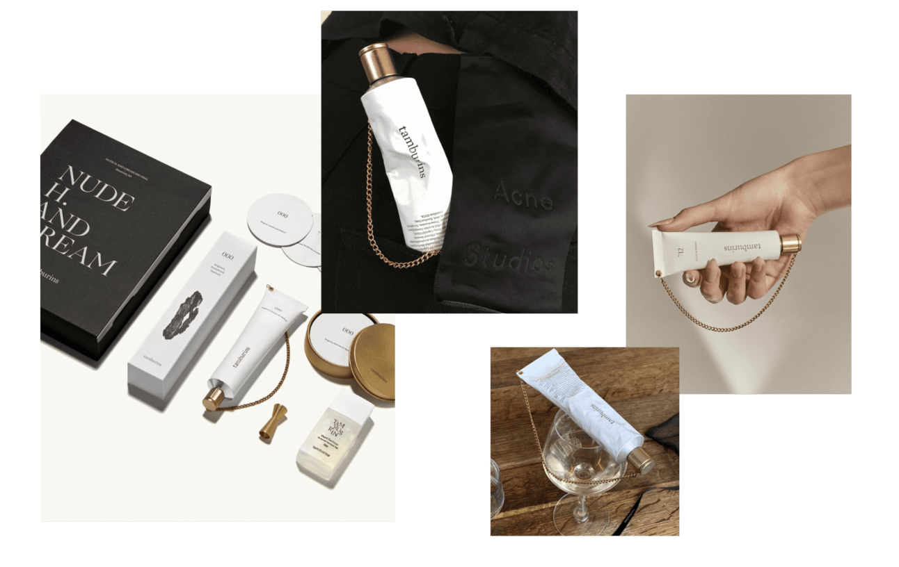
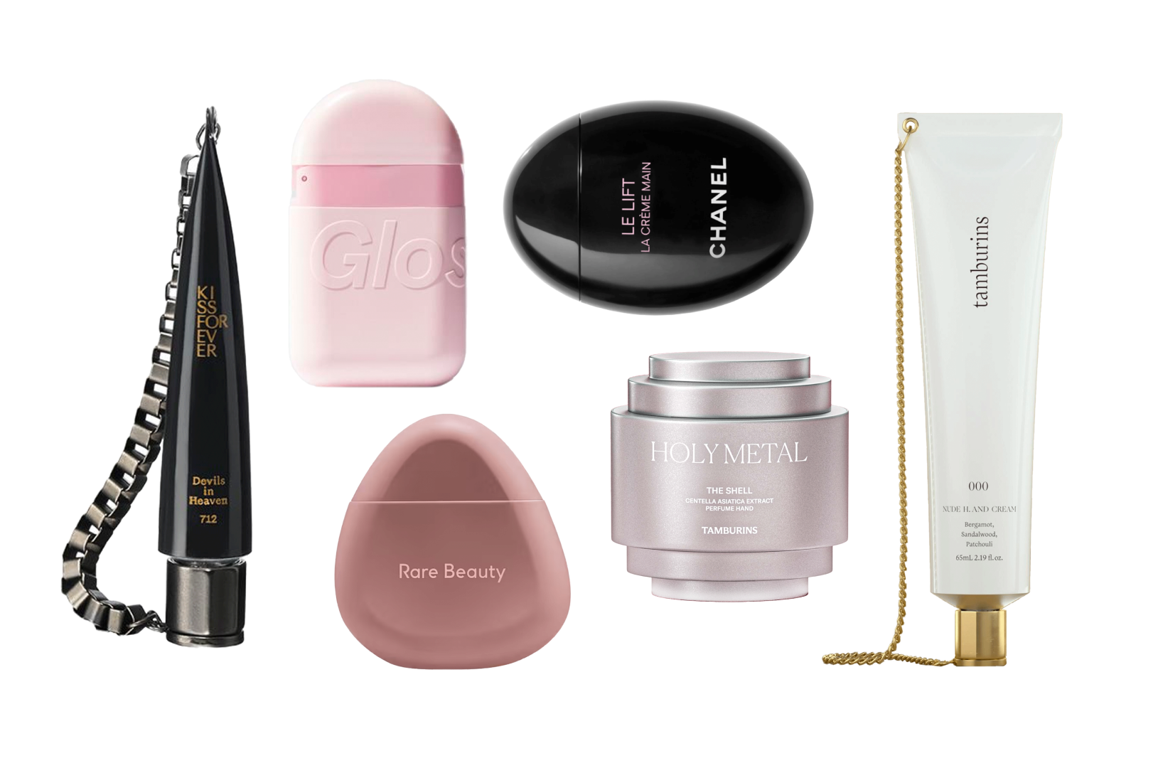
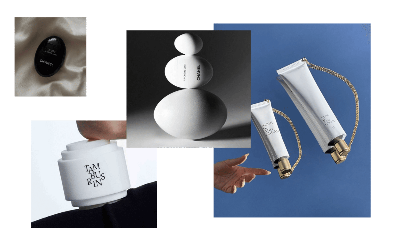
The first time I saw Tamburins Chain Hand, I wanted it immediately. Unfortunately, you can only buy it in South Korea. That's intentional. Scarcity strategy.
Chain Hand became an icon worth imitating. The brilliance is in the simplicity: white aluminum tube, classic gold chain, thin serif font. It looks luxurious because it is designed as luxury, not cosmetics.
Tamburins created a new category. You wear this instead of carrying a handbag. You moisturize your hands with perfumery-grade scents like Sandalwood or Patchouli. The brand understood something crucial: experience comes first through shape, second through fragrance. Ingredients are tertiary.
This is affordable luxury philosophy in practice. Tamburins wanted products that people loved beyond their monetary value. They focused on delivering "genuine contentment" rather than clinical efficacy claims. You understand what Tamburins is about the moment you see it. That's brand clarity.
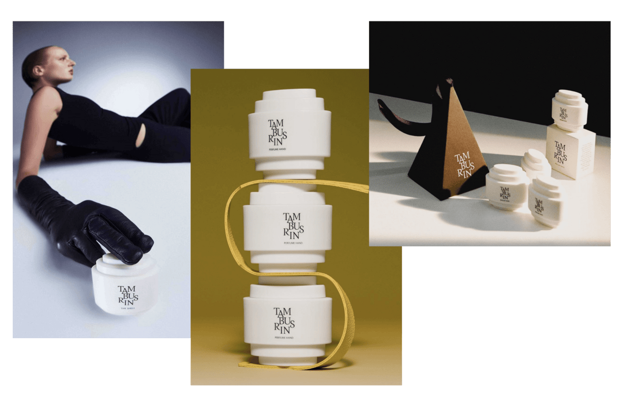
Their other invention, The Shell hand perfume, looks like contemporary sculpture. The texture and color change depending on the fragrance. It positions itself as art, not cosmetics. The antiqua Roman serif font in capitals gives you ancient, refined mood before you even smell it.
Worth noting: Tamburins is owned by Gentle Monster, the optical brand famous for experiential retail and scarcity marketing. They know how to build brand presence and exclusivity. Tamburins inherited that DNA.
Signal from Noise: hand cream packaging can function as wearable accessory when designed for visibility and portability first, moisturization second. The product becomes a signal of aesthetic taste, not just a functional item.
Make it timeless enough to transcend trends
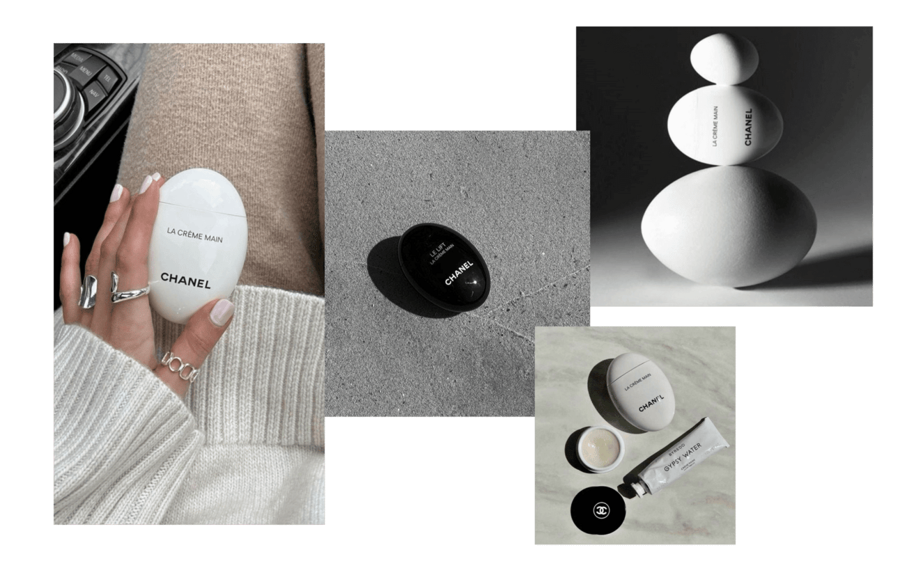
Chanel needs products with decades-long sales potential. La Crème Main in its egg shape appears to be exactly that. Black and white. Simple. Fits any aesthetic, any outfit, any context.
This is the hand cream I see most frequently in my feed. I'm calling it now: this will have Maison Margiela Tabi boots longevity. Timeless.
But here's the problem. Despite highly attractive packaging, the hand cream scored 7/10 in lab tests. That's good, but not great. And when you're charging premium prices based on packaging aesthetics, customers expect the formula to match. Reviews can destroy a product's reputation faster than beautiful design can build it.
Don't let packaging excellence cover for formula mediocrity. Premium looks demand premium performance.
Play with texture and color psychology

Glossier's hand cream was a palm-sized cult object. Matte texture with embossing. Different pink shades for base, upper section, and cap (light pink, darker pink, scarlet). It sold out immediately. Then Glossier discontinued it without explanation.
But it proved something: texture variation and color blocking can create obsession-level product desire.
Design insight from Orchidea. Manufacturers struggle to maintain consistent color across different plastic packaging components. Glossier solved this by intentionally using different shades. Light pink base, darker pink upper, scarlet nose. This avoids color mismatch issues while enhancing the overall aesthetic. Turn a manufacturing limitation into a design feature.
Leverage social proof and functional dual-purpose
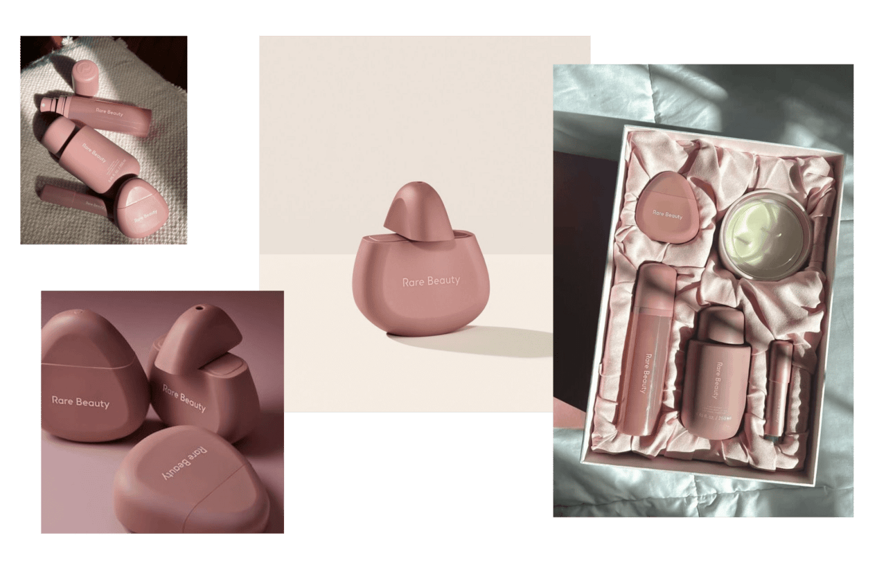
Rare Beauty's Find Comfort Hand Cream went viral on TikTok. Not because of Selena Gomez. Because someone noticed the stone-shaped design works as both moisturizer and hand massager.
User-generated discovery is more powerful than brand messaging. Let people find the hidden value themselves.
The brand's sophisticated color palette across the entire product line elevates what could look cheap. Matte finish on plastic packaging solves the "how do we make plastic look premium" problem that most brands struggle with. Check the unboxing videos. People treat it like luxury, even though it's plastic.
I have high standards for celebrity brands. This one works because the design system is coherent and the product has genuine utility beyond the founder's name.
Viral TikTok discovery generated organic reach that paid advertising couldn't replicate. User-identified dual functionality (moisturizer + massager) drove word-of-mouth beyond brand's original positioning.
Avoid trend-following that erodes brand identity
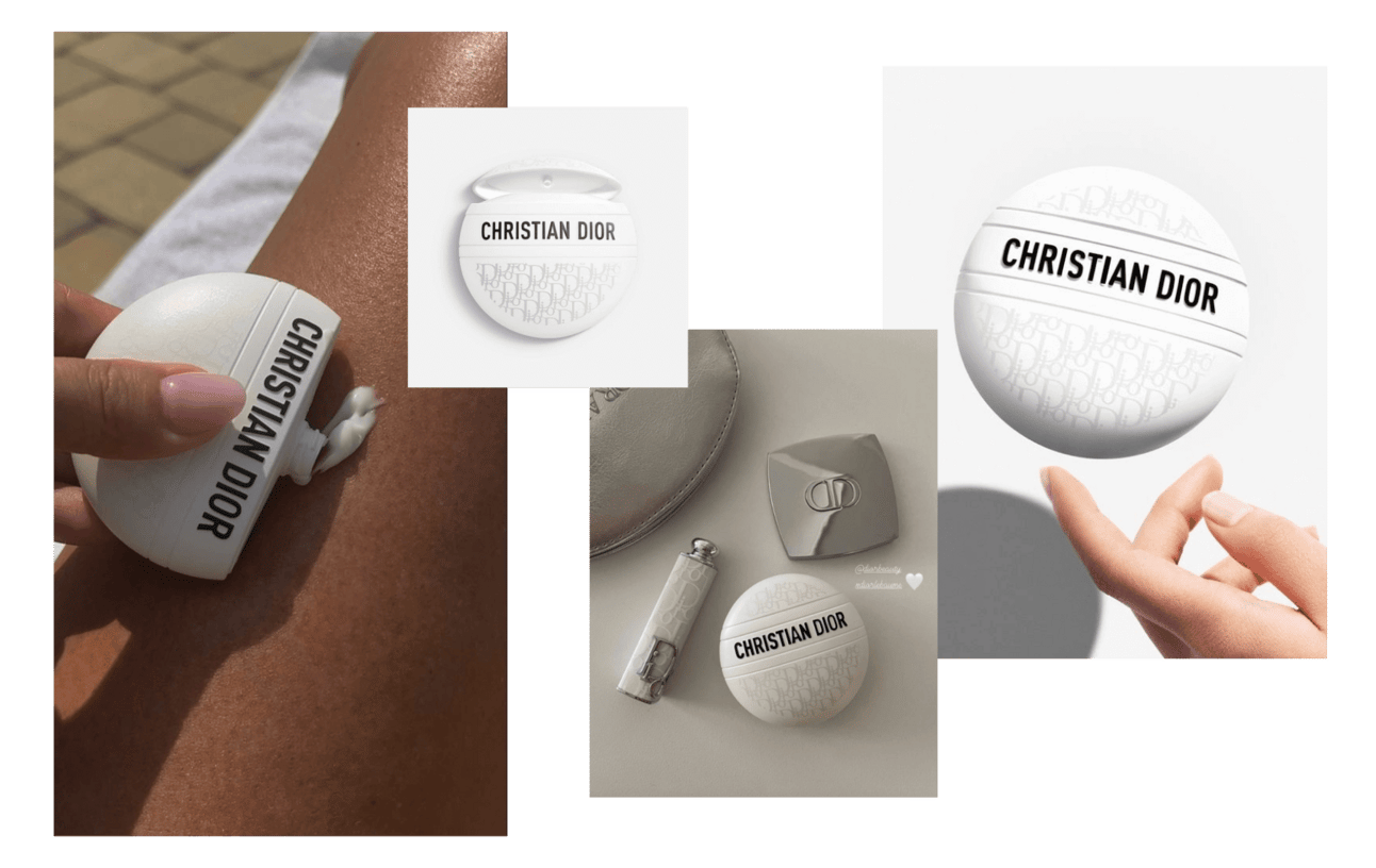
Dior's Le Baume makes me uncomfortable. The egg shape clearly mimics Chanel. The packaging is covered in "Christian Dior" logos and Dior pattern in serif. It looks desperate.
In hard luxury, name-dropping elevates price tags. But Dior is haute couture. They should be setting trends, not following them. The aggressive branding distracts from the pebble-shaped pod and kills any elegance.
Here's the cultural shift Dior is missing: upper-tier brands are moving toward Quiet Luxury. Recent fashion trend that discourages overt status displays through logos. Will this migrate into beauty? We'll see. But brands that figure it out first will own the next decade.
Common Mistake: Copying competitor packaging shapes while adding more logos doesn't create differentiation. It signals you're a follower, not a leader. Premium customers notice. They care.
Strategic principles for hero product development
- Create proprietary packaging architecture, don't replicate icons. Chanel's egg exists. You can't make a better egg. Make something else entirely. Be the trendsetter. The imitators will come later.
- Design for multi-year relevance, not seasonal trends. Custom packaging is expensive. It only pays back if the product has longevity. Think decades, not launches. Resources invested in timeless design compound over time.
- Externalize customer aspiration through product form. Your hand cream should communicate: "I elevate your status." Figure out what your customers want to signal about themselves, then design the physical object that does that signaling. Tamburins signals refined taste. Rare Beauty signals informed discovery. What does yours signal?
- Match formula quality to packaging premium. Don't create beautiful packaging for mediocre formula. Premium aesthetics set expectations. If the product doesn't perform, reviews will kill it. Chanel learned this. Don't repeat the mistake.
- Build community, not just customer base. Word-of-mouth requires people who care enough to talk. That requires community, not transactions. It's not easy. But viral TikTok discovery doesn't happen without genuine user enthusiasm.
Hand cream evolved from functional product to status accessory. Brands winning this category understand packaging as primary value proposition, with formula quality as mandatory baseline. The product needs to be photographable, portable, and recognizable before efficacy even matters.
February 15, 2024