This edition examines Christmas special packaging, powerful tool brands use to drive sales during holiday frenzy. The more attractive and thoughtfully crafted your offer, the more orders you'll secure.
Some brands skipped holiday-themed packaging. We think they missed big opportunity. Bundling slower-moving products with festive packaging could help reduce inventory while boosting sales. For those who embraced the season, results spoke for themselves. We've reviewed this year's holiday packaging and compiled strategies to spark inspiration for next year's preparations.
oribe: partner with artist for creative edge and narrative depth
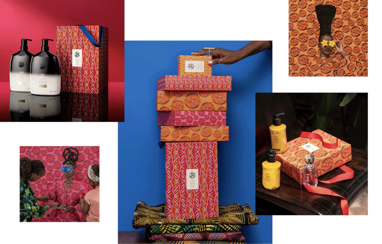
Oribe introduced Holiday 2024 Collaboration with Kenyan artist Thandiwe Muriu, featuring six limited-edition gift sets. Vibrant, artistic packaging told story of community and creativity.
Collaborating with artists adds depth to brand narrative. If it aligns with core philosophy. This isn't just decoration. It's cultural positioning. Oribe signals they value artistic expression and global creative communities. That attracts customers who identify with those values.
The artist collaboration also solves practical problem: how to create distinctly different holiday packaging without abandoning brand identity. External artist brings fresh visual language while Oribe maintains control over product and messaging.
Strategic pattern: Artist collaborations for seasonal packaging create narrative depth and visual distinction without requiring internal creative team to abandon brand DNA. External creative voice allows temporary deviation from primary aesthetic while maintaining brand philosophy alignment.
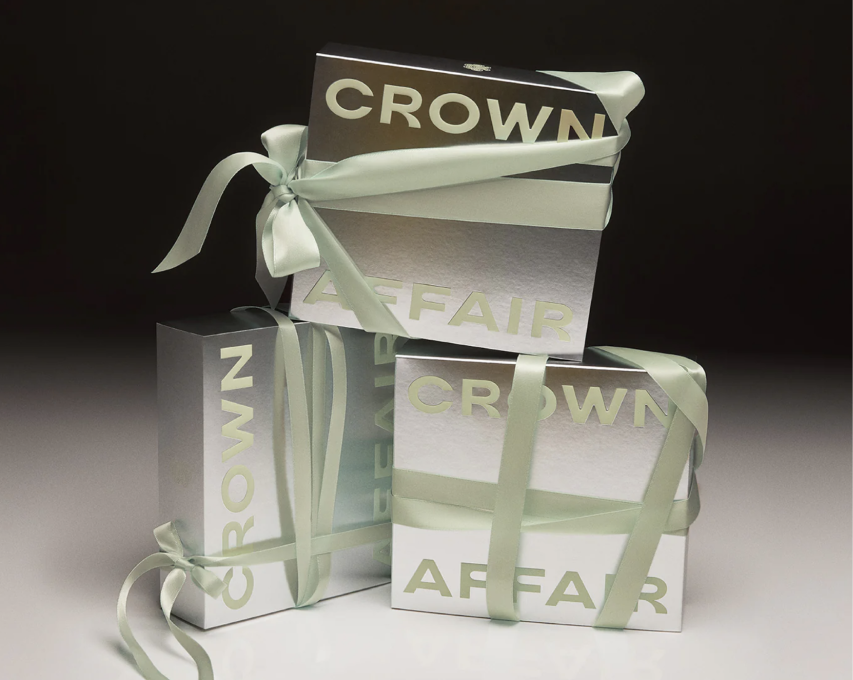
crown affair: harness campaign cohesion for holiday associations
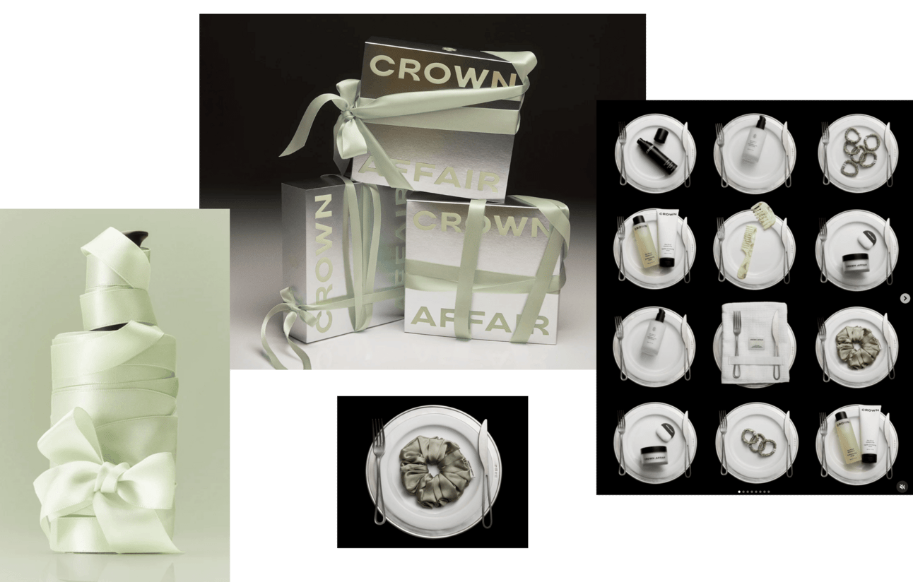
Crown Affair took holistic approach, designing campaign inspired by charm of festive dinner setting. Haircare products showcased alongside elegant dinnerware, building strong holiday associations.
Packaging was equally refined: silver with mint logo and silky ribbon. Striking perfect balance between sophistication and minimalism.
The strategy isn't just making pretty packaging. It's creating entire holiday world where product becomes natural participant. When you see Crown Affair products on dinner table next to fine china and crystal, your brain creates association: this belongs in elevated holiday celebrations.
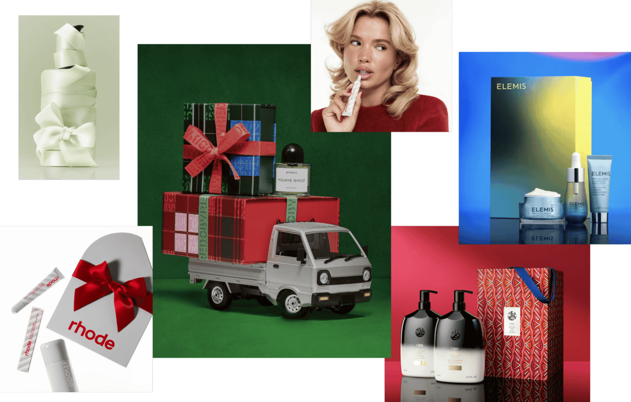
elemis: tailor bundles to fit any budget tier
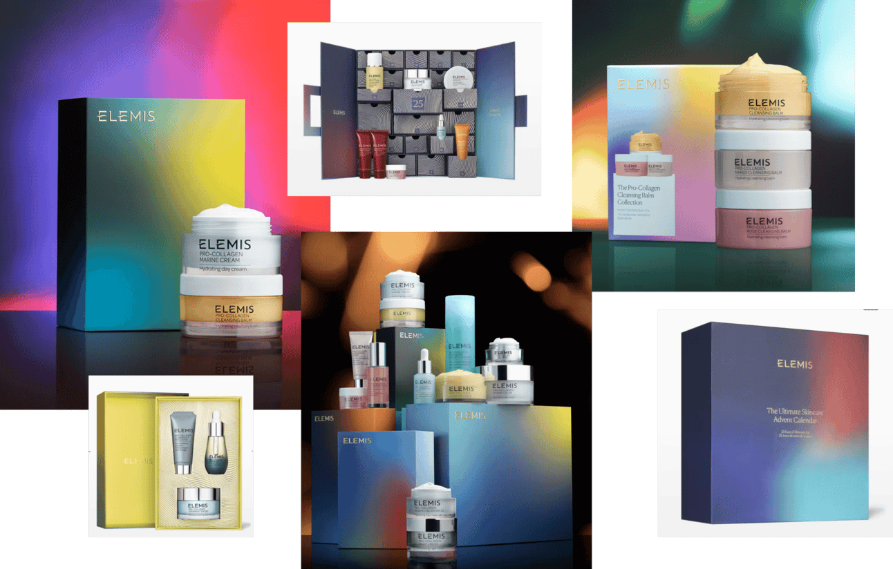
Elemis created range of bundles suiting various price points. From simple Duos to Ultimate Skincare Advent Calendar—treasure trove for year-long skincare needs.
Mysterious, gradient-filled box designs exude sophistication and status. Incorporating gold and silver lines within packaging added luxurious touch. Cohesive color palette tied sets together beautifully.
The multi-tier bundling strategy is smart inventory management. Lower-priced Duos capture impulse gift buyers. Mid-tier sets appeal to established customers. Ultimate Calendar justifies premium spend for superfans or corporate gifting.
Each tier uses same design language (gradients, gold/silver accents) so entire range feels cohesive on retail shelf. Customer can trade up or down based on budget without feeling they're getting "lesser" version. Just different scale of same luxurious experience.
Orchidea strategic advice: For beauty brands planning holiday packaging programs, design tiered bundle architecture (3-5 price points from $25 and upper) using consistent visual language across all tiers. Start planning six months before launch—packaging production, bundle configuration, and campaign development require longer timelines than regular product launches.
byredo: evoke emotions through campaign-packaging cohesion
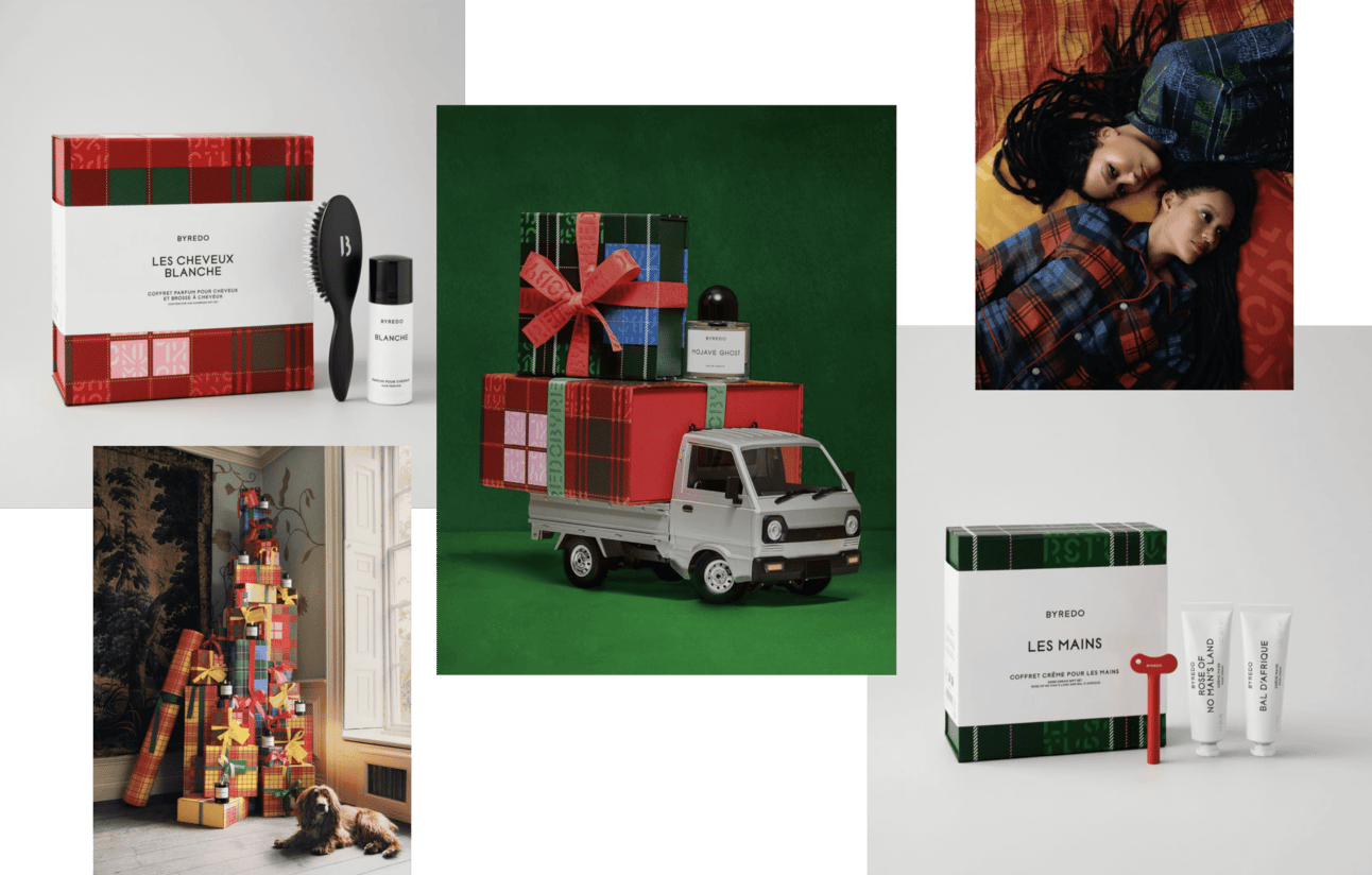
Byredo introduced Togetherness Holiday 2024 campaign focusing on warmth of home celebrations. Packaging featured cozy English checkered pattern evoking comfort and tradition, complemented by minimalist black-and-white band staying true to brand aesthetic.
Campaign visuals amplified homey vibe, showcasing models in matching fabric elements like warm pajamas, perfect for intimate holiday moments. Byredo positioned products as thoughtful gifts, ideal for discovering under beautifully decorated tree.
What makes this work: complete alignment between packaging design (checkered pattern = cozy tradition), campaign imagery (models in pajamas = intimate home moments), and messaging (togetherness, home celebrations). Every touchpoint reinforces same emotional territory.
grown alchemist: overwhelming visual complexity draws attention
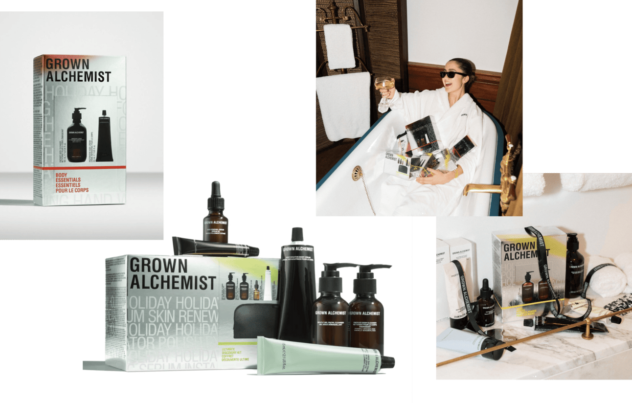
Grown Alchemist went bold with holiday packaging, starkly contrasting their minimalist primary designs. Outer boxes featured silver paper, faded typography, gradients, product images, tied together with thin ribbon placed at ideal golden ratio.
Design sounds busy. But it works, eye-catching and intriguing, especially enhancing visibility on retail shelves.
Including product images on box improves customers' understanding of what to expect inside, making purchasing decision easier. This is practical consideration disguised as design choice. Holiday gifting creates anxiety (will they like this?). Product imagery reduces that anxiety.
The strategic deviation from primary minimalist aesthetic also signals: this is special, limited-time, holiday-specific. If it looked identical to regular Grown Alchemist packaging, it wouldn't create urgency. The visual complexity says "this only happens once a year."
Common mistake: Maintaining identical visual language for holiday packaging as year-round products. This creates no seasonal differentiation or urgency. Grown Alchemist's dramatic shift from minimalism to visual complexity signals limited-time specialness. Customers understand: if I don't buy this now, it disappears until next December. That drives conversion during competitive gifting season when shelf space is saturated with options.
drunk elephant: create bold functional gifts beyond seasonal use
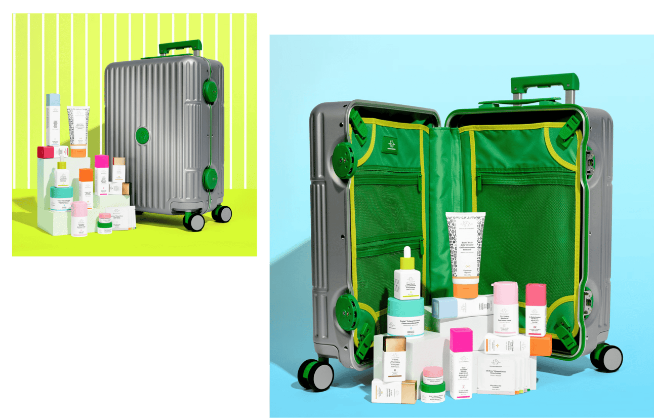
Drunk Elephant made splash with Rimowa-inspired suitcase packed with impressive range of products. Bold, functional, unmistakably in their brand style.
While not overly festive, this clever design doubles as gift that remains appealing even after holiday season. Thoughtful move by brand.
The suitcase isn't holiday packaging that gets thrown away January 2nd. It's functional object customers keep using. Travel case. Bathroom organizer. Desktop storage. The brand stays visible in customer's life long after purchase.
This is premium gifting strategy. Price point justifies functional container because container itself has ongoing utility. Customer perceives value beyond product contents. And every time they use suitcase, they remember Drunk Elephant.
glossier: use trends as situational holiday content
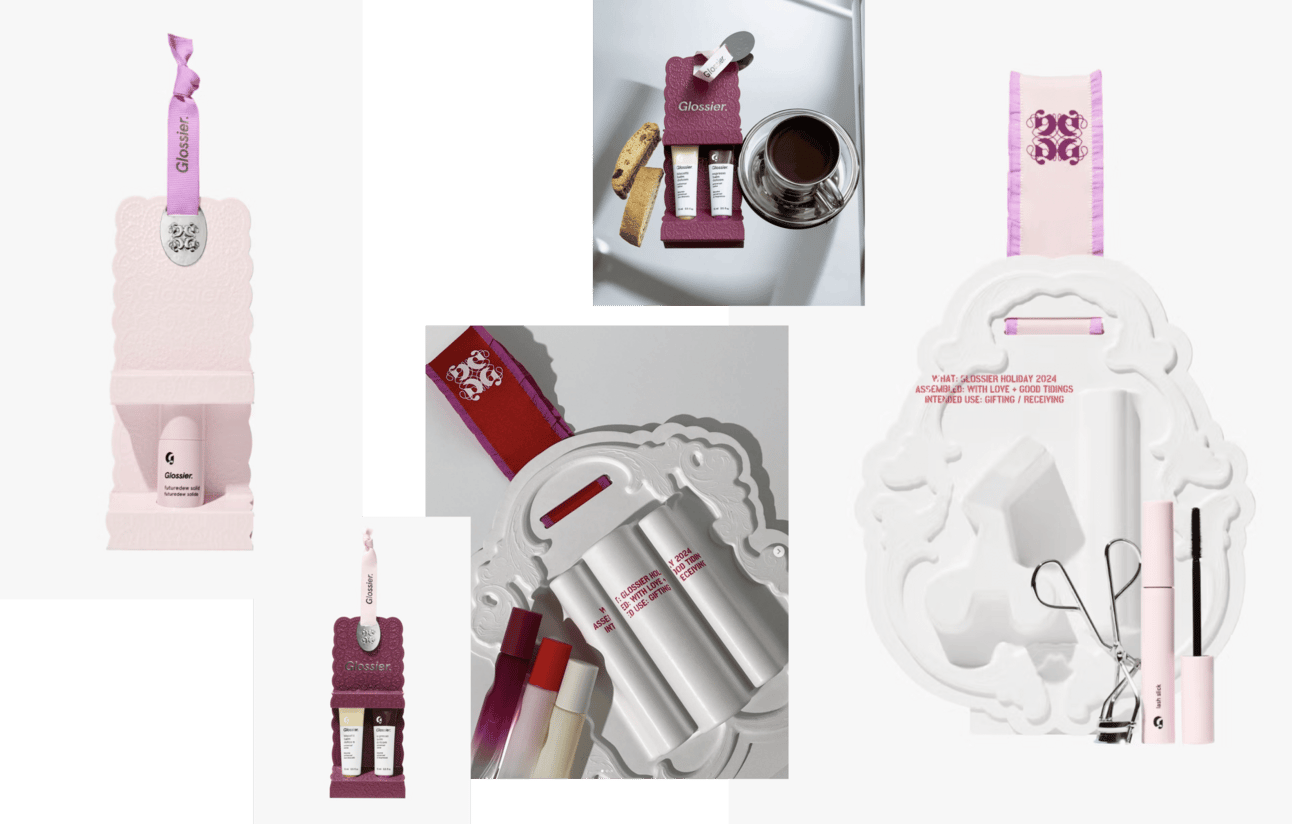
Glossier launched holiday editions late November, showing they planned well in advance. Interestingly, their packaging deviated from signature style, embracing Coquette Core trend with blind-embossed lace details and glossy accents.
They even introduced baroque-inspired emblem reminiscent of luxury heritage brands. Result? Chic, modern design that works beautifully as gift or self-indulgence.
This is strategic trend adoption. Glossier recognized Coquette Core trending heavily in their target demographic (young women on TikTok, Instagram). Rather than ignore it or fight it, they leaned in for seasonal packaging only.
The deviation from brand DNA is temporary and clearly marked as special edition. No one thinks Glossier permanently shifted to baroque luxury aesthetic. But for holiday 2024, they capitalized on cultural moment their audience was already participating in.
rhode: with clear brand dna, new launches come effortlessly
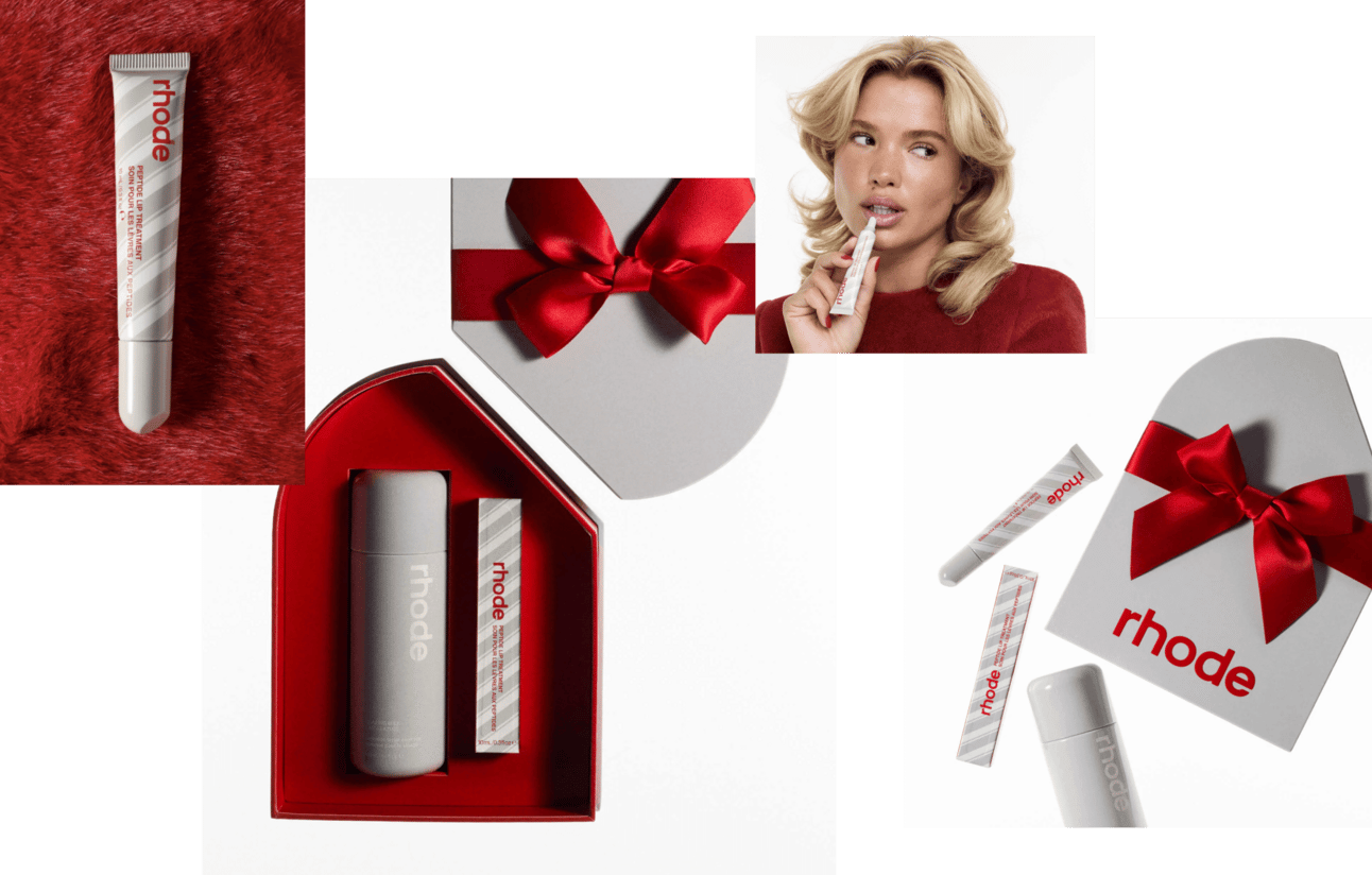
Rhode kept it simple but effective, leveraging signature cut cap shape and branding. By coloring boxes and primary packaging in festive red and styling campaign just right, they achieved polished holiday look.
Standout touch: striped candy stick pattern on product adding festive mood. Red and grey color scheme? Unquestionably sexy.
This demonstrates power of strong brand DNA. Rhode doesn't need to reinvent anything. Their diagonal cap is already iconic. Just make it red. Add candy stripe pattern. Done. Holiday packaging complete.
Brands with weak DNA struggle here. They don't have signature elements to amplify. Rhode's simplicity works because foundation is so strong. The red cap is still instantly recognizable as Rhode while clearly signaling holiday special edition
ultra violet: make packaging unmissable from distance
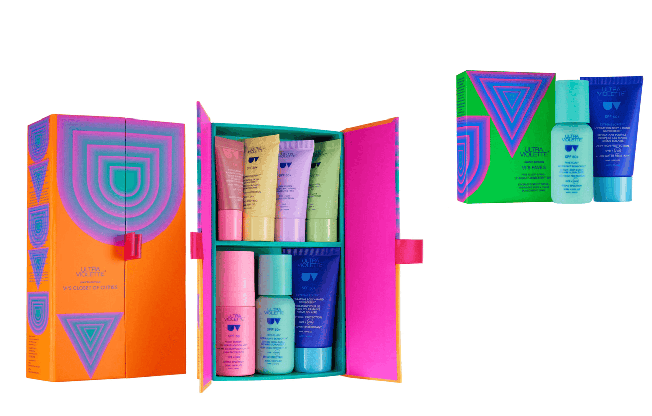
Ultra Violet introduced wardrobe-style packaging opening to reveal products displayed like treasures on shelves. Interesting solution, though it could be adopted by any beauty brand.
What truly sets it apart: acidic colors and illusionist gradients on logo, creating energetic and visually striking design you won't miss from distance.
The wardrobe mechanism is clever but not unique. The color intensity is unique. Acidic neon tones cut through visual clutter on holiday retail shelves packed with red, green, gold, silver packaging from every other brand.
charlotte tilbury: create packaging that wows through excess
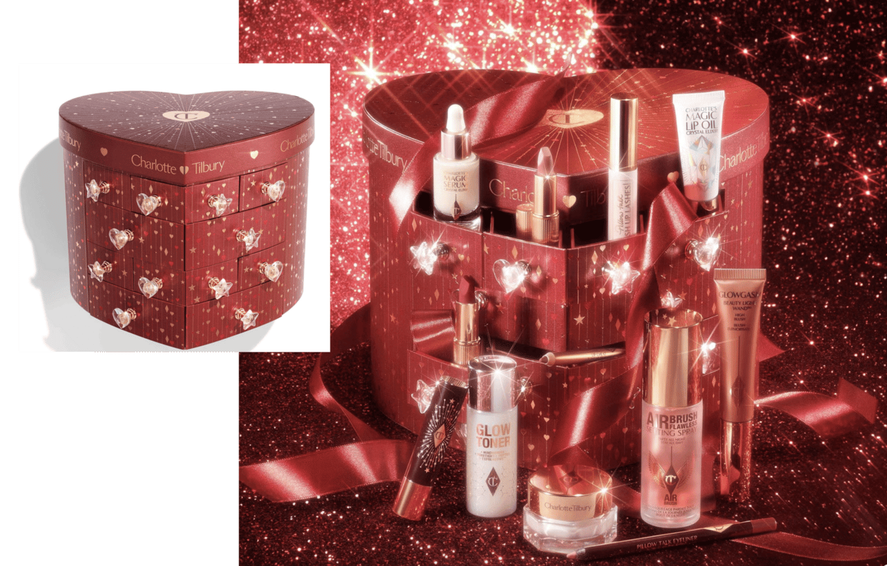
Charlotte Tilbury wowed with advent calendar presented in burgundy heart-shaped box, complete with crystal star-heart handles. Even if you're minimalist, this luxurious creation might just win you over.
This is unabashed maximalism. Heart shape. Crystal handles. Burgundy velvet. Twenty-five days of products. It's excessive. That's the point.
Charlotte Tilbury built brand on glamour and luxury. Holiday packaging amplifies that to extreme. For their customer base (people who want dramatic makeup and aspirational beauty experience), the heart-shaped crystal-handled box IS the gift. Products inside are almost secondary to packaging spectacle. This only works because it's completely aligned with brand identity. If minimalist brand tried this, it would feel confused. For Charlotte Tilbury, it's brand essence at holiday volume.
How to use this intelligence:
- Timeline and planning. Plan holiday 2025 packaging by June for December launch. Six-month minimum required for packaging production, bundle configuration, and campaign development.
- Inventory strategy. Audit inventory for slower-moving products that could bundle into festive sets. Holiday packaging functions as inventory reduction tool disguised as seasonal offering.
- Tiered architecture. Design 3-5 price points using consistent visual language across all tiers like Elemis. Lower tiers capture impulse gifters, mid-tier appeals to established customers, premium tier maximizes superfan revenue.
- Strategic approach decision. Will you amplify existing brand DNA (Rhode's red cap variation) or create temporary deviation (Glossier's Coquette Core)? If deviating, ensure it's clearly marked as special edition to avoid confusing core identity.
- Color strategy. Test color choices against holiday retail environment. Traditional red/green/gold or disruptive acidic neons like Ultra Violet? You're competing with entire store's gifting section, not just category neighbors.
Brands skipping seasonal packaging miss competitive gifting season differentiation and inventory management opportunity.
December 19, 2024