Can you guess which deodorant is which? They all look like Salt & Stone, don't they?
That sleek, rounded packaging shape became hallmark of aluminum-free deodorant era. Clean, modern, clear upgrade from drugstore basics. Plus it's budget-friendly—thanks to ready-made molds.
The downside? As more brands embrace this design, the look loses uniqueness. Becoming harder to stand out in crowd. Yet few brands still manage to shine despite familiar shapes. Why? Because branding is what truly makes difference. Right mix of colors, typography, overall vibe can turn "just another deodorant" into the one customers grab off shelf.
US deodorant market projected to hit nearly $26.64 billion revenue this year, with steady 3.51% annual growth rate through 2028. Globally, body care segment set to grow even faster—nearly 6% annually. In 2021, already worth $26.93 billion.
Personal care niche offers massive opportunities. Your packaging doesn't need to reinvent the wheel. No matter your budget, you can still make strong impact.
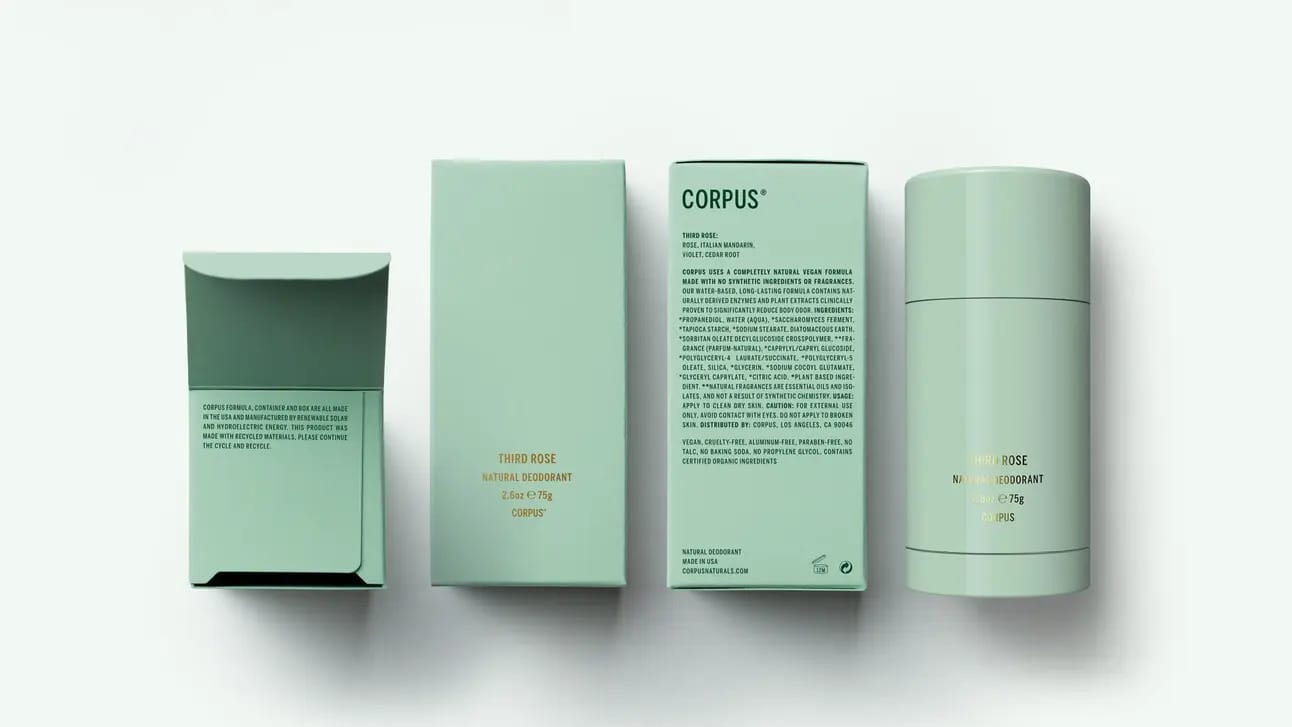
corpus: stick to color combination, build immersive universe

Corpus, personal care brand launched 2018 by Jean-Pierre Mastey, started with natural deodorant in six scents priced at $26. Now expanded into body wash, butter, scrub, shampoo, conditioner.
What really sets them apart: mint-green bottles paired with chic, gold minimalist typography. Not just pretty. Strategic. By sticking to this color combo across all products, they've built strong visual identity that's hard to miss. Mint isn't just color for them. It's immersive branding universe.
On business front, Mastey keeps things grounded with cash flow-positive model, avoiding outside investments. This lets them grow steadily without losing control. Over 300 retail locations worldwide, including Nordstrom and Bluemercury. Corpus is thriving.
Sure, their success isn't just about mint color. But let's face it—it definitely plays a part. The color ownership creates instant shelf recognition. When you see mint-green personal care in Nordstrom, you know it's Corpus before reading the label.
Color ownership in personal care creates instant brand recognition when executed consistently across entire product line. Corpus's mint-green isn't seasonal or product-specific—it's brand signature applied universally. This consistency allows ready-mold packaging (shared with competitors) to become distinctly Corpus through color alone. Investment shifts from custom packaging molds to brand consistency enforcement across SKUs.
malin+goetz: use typography as visual pattern system
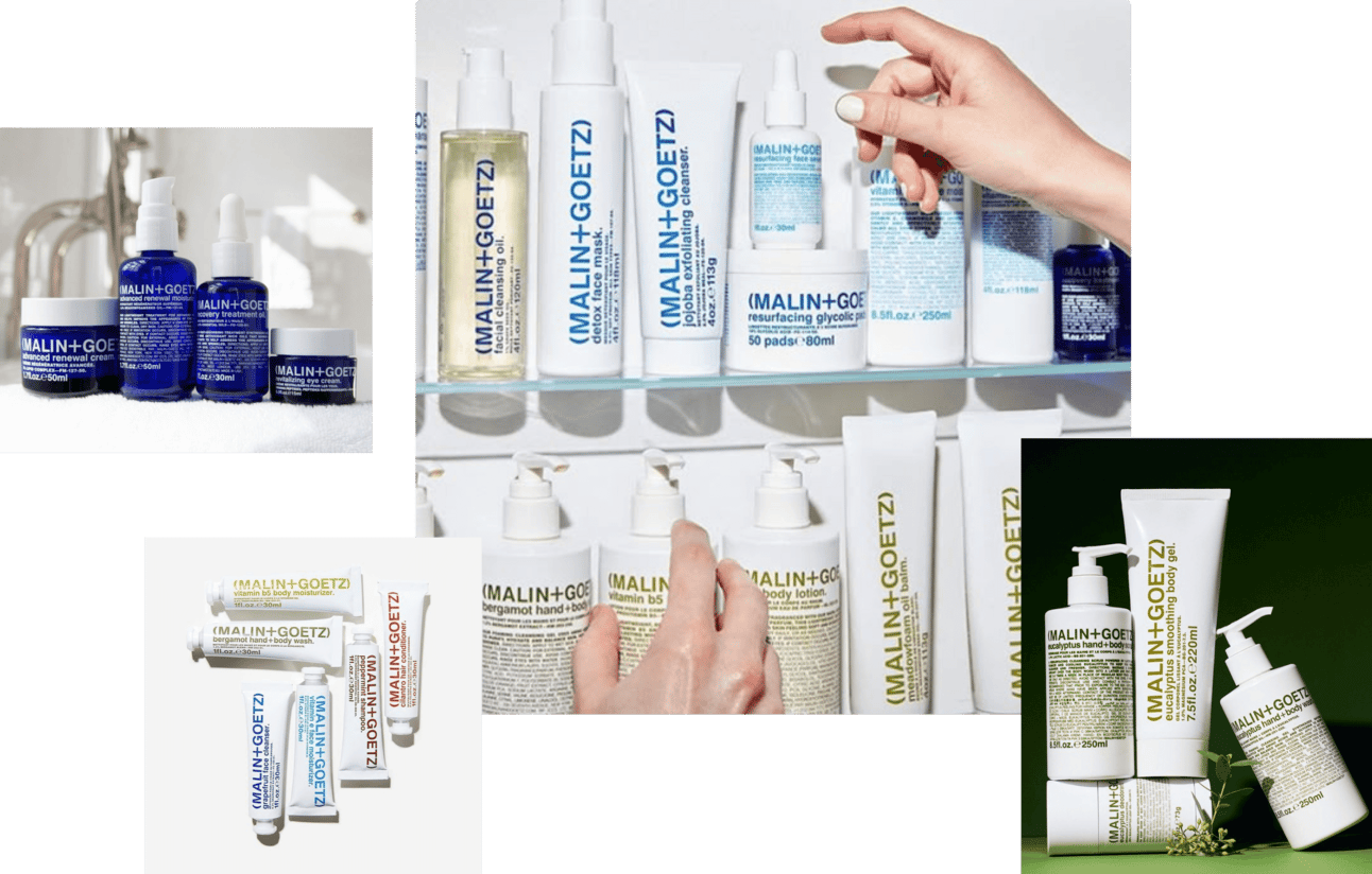
Malin+Goetz redefined modern apothecary design when they launched in 2004. Concept remains fresh today as it did nearly two decades ago. Founded by Matthew Malin and Andrew Goetz in New York, brand blends bold, colorful typography with minimalist white packaging, creating clean, unisex aesthetic emphasizing transparency and simplicity.
What's inspiring about their story: how founders' diverse backgrounds shaped brand. Matthew Malin brought beauty industry expertise from Kiehl's and Prada. Andrew Goetz added marketing and design experience from Swiss design icon Vitra. After career hiccup at Prada, Malin asked himself game-changing question: "If not now, when?" That's when Malin+Goetz was born.
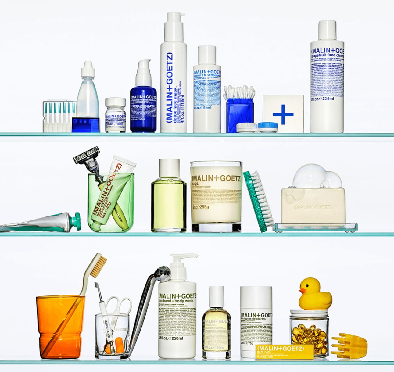
What’s inspiring about their story is how the founders’ diverse backgrounds shaped the brand. Matthew Malin brought years of beauty industry expertise from stints at Kiehl’s and Prada, while Andrew Goetz added his marketing and design experience from Swiss design icon Vitra. After a career hiccup at Prada, Malin asked himself the game-changing question: “If not now, when?” That’s when Malin+Goetz was born.Their guiding principle, "less, but better," isn't just about products. It's infused into branding too. Signature use of typography—single colors paired with varying font sizes, mixing lowercase and uppercase—creates visual pattern without need for custom bottle shapes. By pairing clever design with vibrant colors, they've made even simplest packaging iconic and unmistakably theirs.
The typography system works because it's consistent yet flexible. Same white bottle. Different color per product. Different word. Different font size variation. But pattern is recognizable instantly. That's brand architecture working efficiently.
For personal care brands with $50k+ brand development budgets using ready-mold packaging, invest in typographic system design rather than custom bottle molds. Malin+Goetz's lowercase/uppercase mixing with single-color variation creates infinite SKU expansion while maintaining instant recognition.
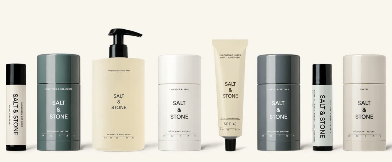
salt & stone: fits any bathroom shelf, or even elevates it
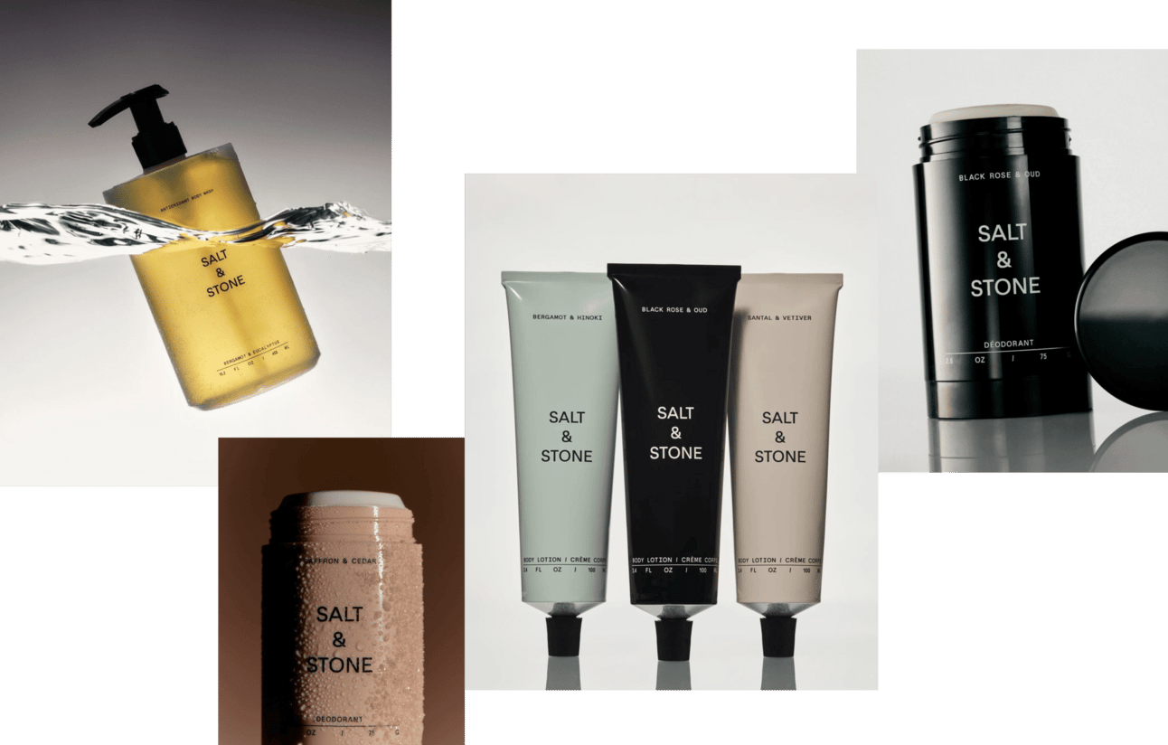
Salt & Stone, unisex skincare brand founded by former professional snowboarder Nima Jalali (unexpected, right?), carved distinct space in personal care by combining natural ingredients with advanced skin science. Minimalist packaging in pale, earthy tones seamlessly blends into any bathroom shelf. Or even slightly elevates it.
Design conveys refined yet understated aesthetic, appealing to both men and women who value quality and style. Salt & Stone's approach positions their deodorants as more than personal care products. They're marker of modern sophistication, even standing toe-to-toe with brands like Aesop.
Central logotype with "&" symbol prominently placed creates minimalist yet impactful identity. Paired with neatly aligned milliliters displayed below, adds subtle scientific touch reinforcing brand's clean, modern approach to personal care.
But it's not just design grabbing attention. It's stylish, highly curated content they produce. Their approach inspired countless brands to emulate their aesthetic and strategies, proving Salt & Stone's influence extends far beyond their own lineup.
Originally direct-to-consumer brand, Salt & Stone grew into global powerhouse. Partnering with Sephora and other premium retailers while maintaining 80% of sales through DTC channels. Consistent triple-digit growth. Projected 2024 revenues between $65 million and $80 million. Brand is testament to how sustainability and profitability can thrive together.
Their 70% female and 30% male customer base became unique selling point for retailers. Now with fresh investment, Salt & Stone set to expand product range, deepen retail partnerships, solidify position as leader in eco-conscious personal care.
Founder Nima Jalali: "In every single retail partner we are in, we are the No. 1 deodorant partner and often the No. 1 body wash partner, too."
chanel: luxury brands play different game entirely
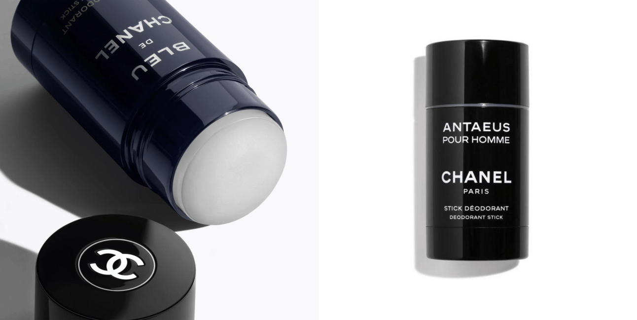
We all know Chanel. No need for introductions. But let's state obvious: when you have brand story as iconic as theirs, paired with massive marketing investments, legendary products, flagship stores on Paris's most famous streets, you don't need to overthink uniqueness. Pick great shape, stick logo on it, watch it shine.
For everyone else? If you don't have all that backing you up, time to play smart. Branding is where magic happens.
This isn't actionable insight for emerging brands. It's reality check. Chanel can use commodity packaging because brand equity does all recognition work. You can't. Don't compare your brand with luxury giants. They play in another league entirely.
eadem: reflecting philosophy in every brand action
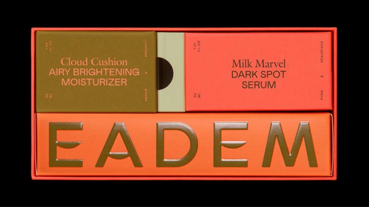
Founded 2020 by former Google colleagues Marie Kouadio Amouzame and Alice Lin Glover, Eadem on mission to revolutionize skincare for women of color. Addressing hyperpigmentation and dark spots, brand uses "Smart Melanin" technology creating safe, effective products for melanin-rich skin. Their name, Eadem—Latin for "the same" or "all"—reflects philosophy of inclusivity and shared experiences.
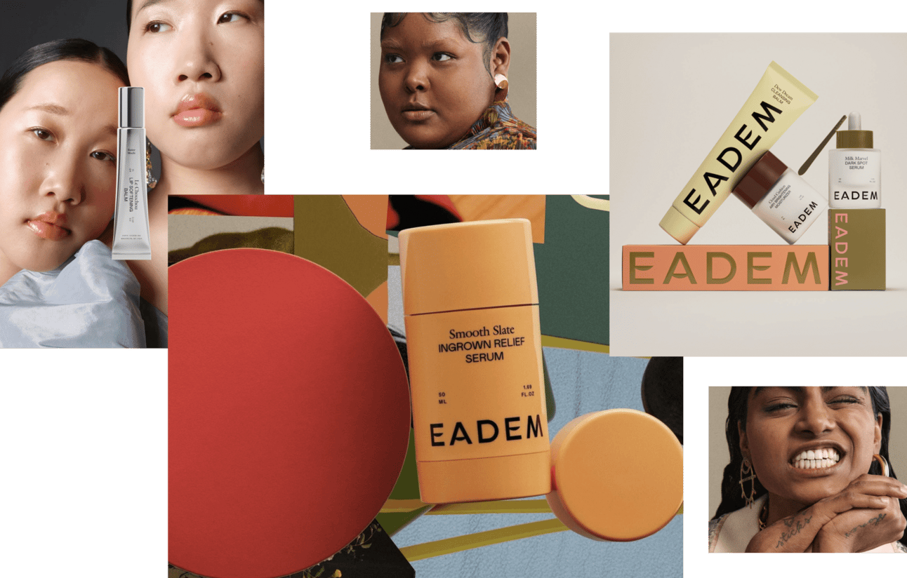
Eadem's bold design extends to their Ingrown Relief Serum, packaged in exact shape of deodorant. At first glance, many—including myself—mistook it for one. But this playful twist works. Bold typography, custom letters in logotype, warm-toned collages, campaigns spotlighting unique models. Brand rejects traditional beauty clichés, embraces duality and diversity of its audience.
Recognized by Vogue and The Cut. Supported by Glossier's Grant Initiative and Sephora's Accelerate program. Eadem isn't just skincare brand. It's platform for representation. Empowering narratives make it trailblazer in addressing unique needs of women of color.
The packaging shape being identical to deodorant doesn't matter because brand narrative is so strong. Philosophy (inclusivity, Smart Melanin technology, representation) drives every visual decision. The bottle is just container. The story is what sells.
Eadem uses deodorant-shaped bottle for serum (confusing at first glance) but succeeds because brand narrative, visual identity (warm-toned collages, bold typography, diverse models), and mission (addressing women of color skincare needs) create distinction. Brands that invest in custom molds without strong narrative create expensive containers with no meaning. Brands that build compelling story can use commodity packaging and still command attention.
WHAT WE HAVE HERE?
How many of these brands felt obvious to you? And which ones were completely new discoveries?
You might have noticed that we didn’t include Caudalie in the extended version of Revelation article. While its grape-based formulas are intriguing, neither the branding nor the packaging left us inspired enough to highlight. An apothecary-style clean beauty brand might build trust with the right audience, but let’s face it—it’s not exactly groundbreaking.

Conclusions: Ready-mold packaging doesn't prevent differentiation when branding executes strategically through color ownership (Corpus's mint universe across 300+ locations), typographic system (Malin+Goetz's lowercase/uppercase pattern), content curation (Salt & Stone's $65-80M revenue with #1 retail partner status), or compelling narrative (Eadem's Smart Melanin technology and representation mission). US deodorant market hitting $26.64B with 3.51% annual growth proves category opportunity exists regardless of packaging budget. Success correlates with brand consistency discipline, not custom manufacturing investment.
November 14, 2024
.png)