.png)
So, we just got back from Cosmoprof, the grand beauty expo held in the charming city of Bologna, Italy. Let me tell you, the hospitality there, paired with Barbera wine and mouthwatering pumpkin lasagna, was off the charts. But amidst all the hustle and bustle of the expo, we couldn't help but notice one thing stuck out—contrast: how one brands have crowds around, and other was empty.
The contrast at Cosmoprof was striking. High-traffic booths functioned as three-dimensional manifestations of brand philosophy, creating what might be called "spatial thesis statements." Empty booths—characterized by generic grey structures and disconnected communication across touchpoints (website, packaging, sales pitch, physical space)—revealed a fundamental misunderstanding: they treated the booth as a container for products rather than a spatial argument for the brand's worldview.
This pattern exposes a broader shift in beauty brand competition. As digital channels saturate and AI-generated content commodifies visual aesthetics, physical space becomes one of the few remaining opportunities for genuine differentiation. The booth isn't a distribution point—it's a sensory argument. Brands that understand this create queues. Brands that don't create voids.
Reflect core idea of the brand
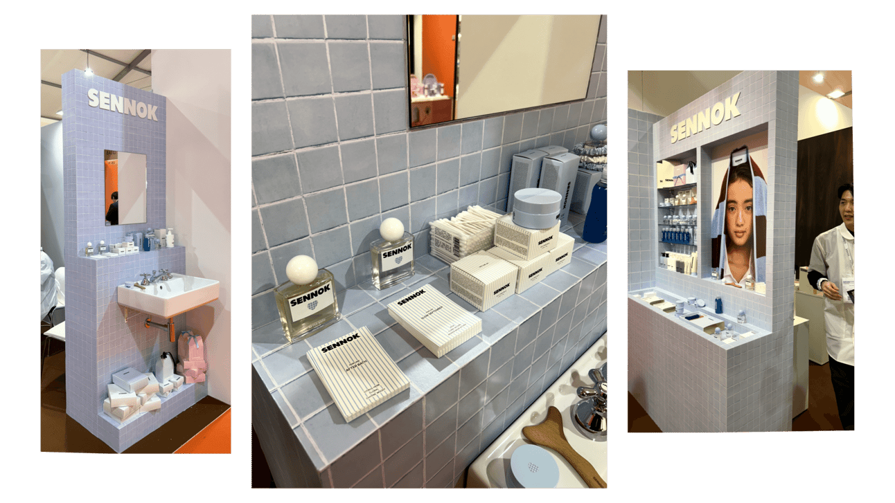
First up, we have Sennok, a Korean lifestyle beauty company. A brand that knows how to convey a vibe without saying a word. Their whole aesthetic screams "bath bliss", from the towel-inspired blue lines on their packaging to the names of their hero products like "afterbath" and "slow September."
The offline stand felt like stepping into a serene bathroom oasis, with the gentle glow of bluish-tinted tiles washing over you like a calming wave. Every detail is highly curated, from the fluffy towels to products organically standing on their bathroom shelves, creating an atmosphere of pure relaxation. It was our first encounter with Sennok, and let me tell you, it left a lasting impression.
Grab attention with a wow effect
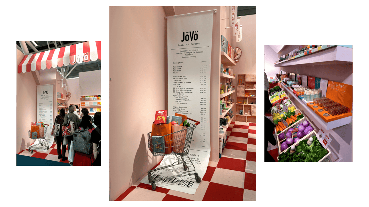
Next on the list is Jovo, a newcomer targeting the Gen-Z audience with decorative cosmetics. Their stand? A whimsical take on a grocery shop, with beauty products nestled among vibrant artificial carrots, beetroots, and an array of colorful veggies. It was a sight to behold, a quirky fusion of beauty and grocery shopping that drew crowds.
The hyperbolization of everyday objects remains a prominent trend in the digital world, actively endorsed by influencers such as Jacquemus. Jovo also embraced this trend offline, creating an enormously huge paper bill and a welcoming supermarket cart at the entrance. Such an installation left a strong impression in the moment, prompting further investigation to discover more wow-effect findings.
Provide a sensorial experience
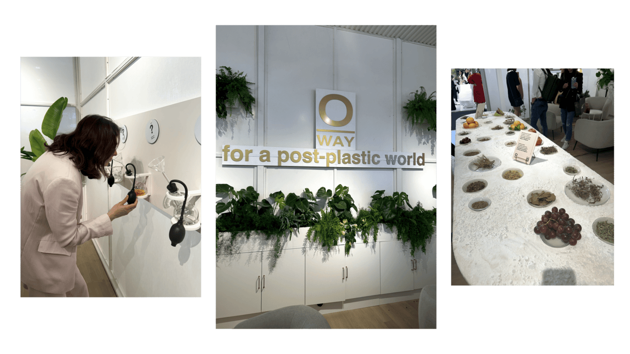
O-way, the Italian brand renowned for its eco-conscious stance, from plastic-free packaging to their circular agricosmetics philosophy. We've been following this brand for years, and it's fascinating to see how they infuse their values into every aspect of their brand experience at the stand.
Their stall was a testament to the purity of their ingredients, meticulously curated to showcase their commitment to quality. But what really caught our attention was the interactive fragrance-guessing game. Guests could pump the aromas of the oils and guess what the ingredient it was.
Now, you might initially dismiss this as a gimmicky stall idea, but when you witness the seamless integration of aesthetics and values—the way it all comes together—it's truly remarkable.
Design merchandise as cultural artifact
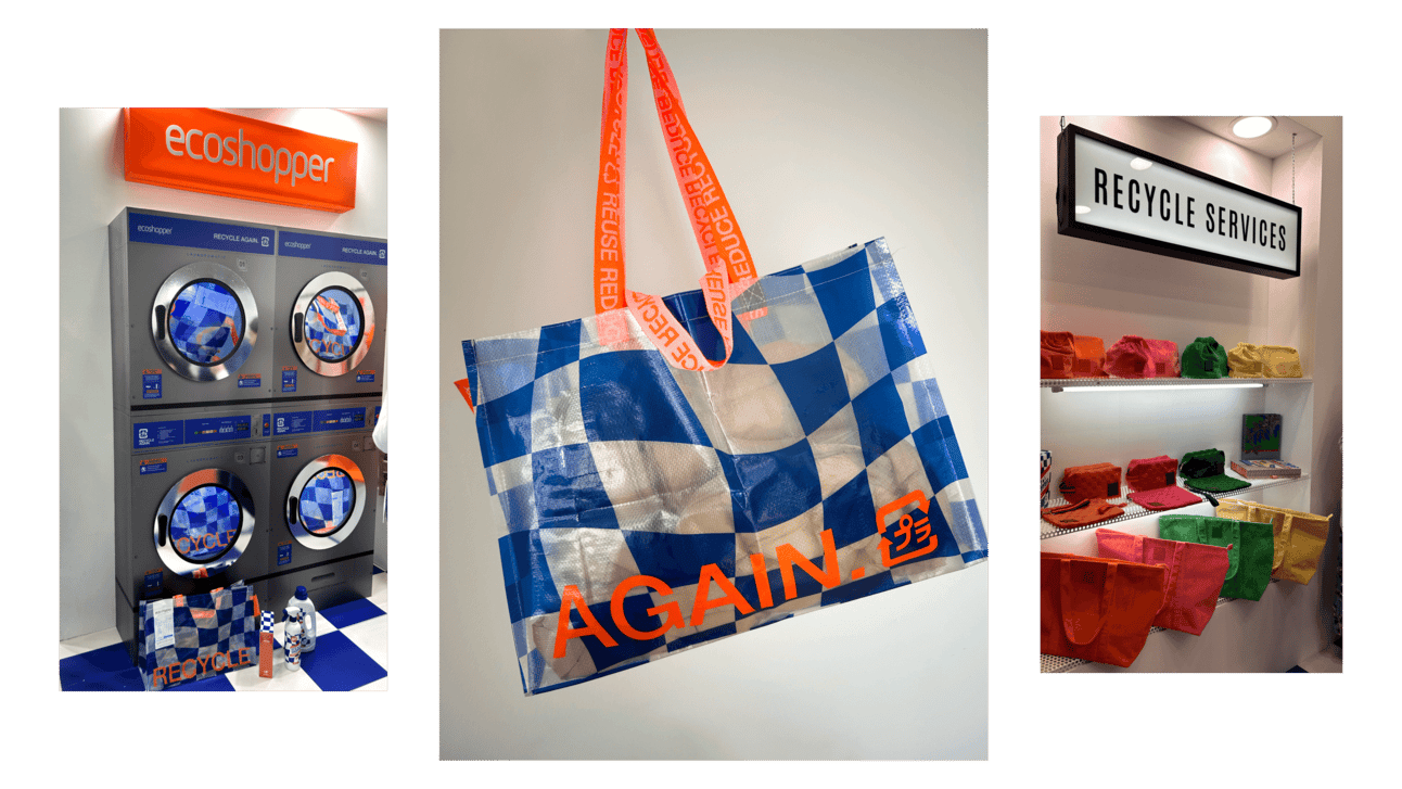
Some brands really nailed it with giveaways you wouldn't dare toss in the nearest bin. Many of them offered small items like samples or lipsticks with QR codes, but the most savvy ones created something truly unforgettable. This year's must-have merch item was a reusable bag with a melted blue checkmate pattern that had us on the hunt for two days straight.
EcoShopper is a recycling services company that provides kits, bags, and reusable bags under white label for brands. At their stand, they used the metaphor of recycling through a washing machine, giving visitors the idea of items being renewed after undergoing a process of washing.
Insider Tip. Here's a funny thing, after we snagged those eye-catching shoppers, nearly five people approached us asking where we got them. It goes to show, eye-catching bag merch is highly effective. We'll definitely be incorporating it into our projects.
Think about welcoming of your stall
Two booths. Same budget (probably $20K-30K). Completely different outcomes. The first one looked like an abstract cave. Closed walls. Uninviting. The only people inside? The sales team, waiting. And waiting. The barrier wasn't a physical wall. It was vibes. Bad vibes. The second booth had rounded shelves and you could walk in from any direction. Open. Welcoming. But once you stepped inside, it still felt private enough for actual conversations. This wasn't an accident.
Walk through Cosmoprof and you'll see the pattern repeat. High-traffic booths all had rounded tables, clear sightlines, multiple ways in. The correlation is obvious once you notice it. Spatial openness reduces the psychological cost of saying "I'm curious about this brand."
Here's the thing people forget: B2B trade shows aren't rational purchasing environments. Distributors and buyers are still human. They still make decisions through sensory and emotional processing. The "professional buyer" in a suit still has the same brain that makes them avoid creepy alleyways and gravitate toward cozy cafes.
Grey walls and closed layouts don't signal "serious business." They signal "we haven't thought about this very hard." For a beauty brand, that's fatal.
Spatial openness isn't about how many square meters you rent. It's about perceptual accessibility. Can people see in from multiple angles? Can they enter from different sides? Do the forms feel inviting (rounded) or hostile (sharp angles, barriers)? This determines whether anyone actually walks up.
The pattern underneath all of this: B2B buyers are aesthetic decision-makers who happen to be at work. They evaluate beauty brands using the same sensory and cultural intelligence they use when shopping for themselves.
Institutional aesthetics (grey, closed, generic) signal institutional thinking. And institutional thinking is exactly what beauty brands need to avoid. You can't sell aesthetic intelligence while demonstrating aesthetic incompetence through your booth design.
It's not subtle. It's not complicated. But somehow, most brands still get it wrong.
For practitioners. Before your next activation, ask five questions:
- Does our space communicate our core idea in 3 seconds?
- Does it create aesthetic disruption or blend into beige?
- Are we using sensory advantages that digital can't replicate?
- Would we personally keep the merch we're making?
- Is the space open and inviting, or does it feel like a fortress? If you fail any of these, you're wasting money.
Trade show success comes from spatial coherence. Your booth should externalize brand philosophy through multi-sensory experience, not function as a product display warehouse. B2B distributors are people too, and they crave visually stunning presentations. Don't settle for dull and grey, captivate with aesthetics!
March 28, 2024
.png)