.png)
Why did Harry Styles adopt nail polish so publicly? Why does shattering gender norms create purchase desire for nail products that existed for decades but were marketed exclusively to women?
The shift isn't about the product formula. It's about cultural repositioning. Nail care moved from "femininity enhancement" to "self-expression tool." That repositioning unlocked new audiences and removed the gender ceiling on market size.
Brands leading this shift use packaging as primary signal. The design language communicates: this is for everyone, this is about identity, this is artistic choice rather than beauty compliance. Here are the brands getting it right.
Pleasing: self-expression across all genders
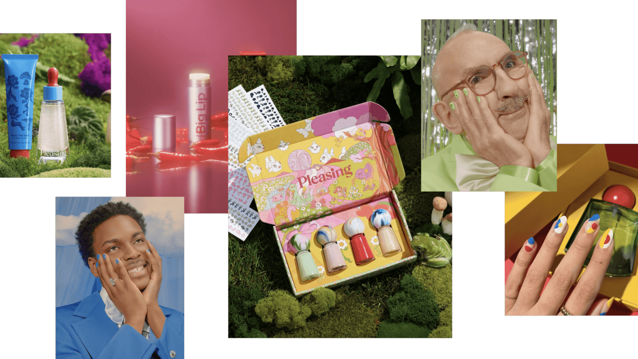
Harry Styles launched Pleasing during the pandemic. Started as nail care extension of his personal love for nail polish. Evolved into a platform for sharing joy and beauty with fans who saw him wearing polish publicly.
The stated philosophy: create products that highlight and celebrate individuality rather than mask it. Make people feel beautiful and confident through self-expression, not through correction or enhancement.
The nail care line delivers vibrant polish shades, each with unique eye-catching cap that mirrors the color beneath. The brand expanded into skincare while maintaining the distinctive round cap as signature design feature.
What's actually happening: Audiences inspired by Harry's public self-expression can participate in that freedom through product purchase. The nail polish isn't functional cosmetic. It's permission structure. It says: if Harry can do this, you can too. The product becomes vehicle for cultural participation.
Designed for everyone. Gender-neutral positioning isn't marketing copy. It's the entire brand architecture.
Off-White: brutalism in beauty packaging
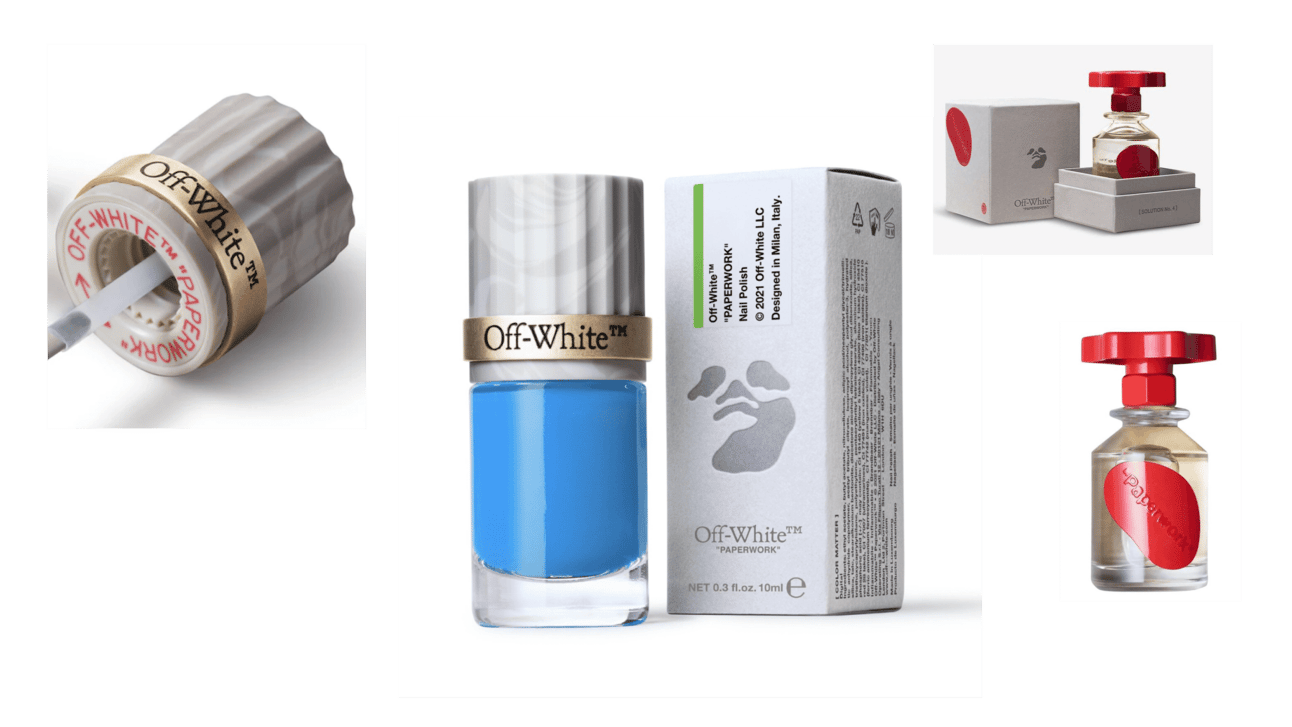
When hype fashion brands enter beauty, it looks like simple brand extension. But Off-White's nail polish packaging is deep expression of core brand identity. You're drawn to it immediately.
The brutal screw lid with metallic ring embodies industrial charm. This design language extends to their fragrance packaging where the lid echoes the same screw motif with distinct flair. It's consistent brutalist aesthetic across categories.
The packaging design nods to Virgil Abloh's fondness for camo print. Camouflaged face subtly integrated into paper packaging. This maintains cutting-edge aesthetic while paying tribute to Abloh's broader artistic vision.
The beauty product isn't separate from the fashion brand. It's the same design DNA expressed through different product category. That's how you avoid the "brand extension that dilutes identity" problem. Off-White nail polish looks like Off-White clothing because it follows the same design principles.
Strategic Pattern: For fashion or lifestyle brands entering beauty with $100K+ product development budgets, extend design language rather than creating separate "beauty aesthetic." Brutalist fashion brand = brutalist beauty packaging. Minimalist fashion brand = minimalist beauty packaging. Identity coherence across categories prevents dilution.
Chillhouse: strong alignment with core brand idea
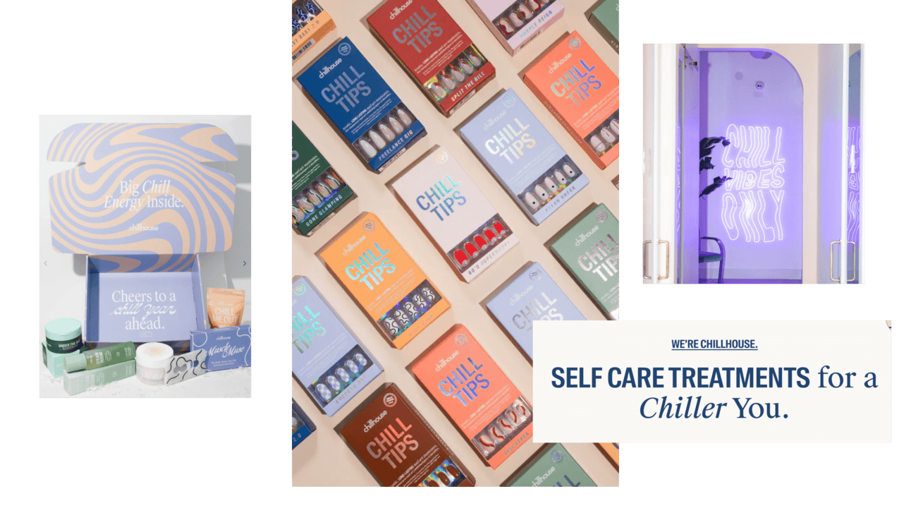
ChillHouse embodies its name in every aspect. Product selection. Messaging. Marketing. Everything centers around "chill."
Their packaging isn't particularly unique. But their "Tips" product line (stick-on nails) shows deep brand strategy understanding. They chose products that align with easy, relaxed self-care concept. No-fuss application. Chill experience from purchase to use.
This demonstrates commitment to making everything about relaxation, down to application details. The product selection IS the brand strategy. They're not selling nail products. They're selling the "chill" feeling. Stick-on nails deliver that better than traditional polish that requires skill and time.
Hermès: modernist play with caps
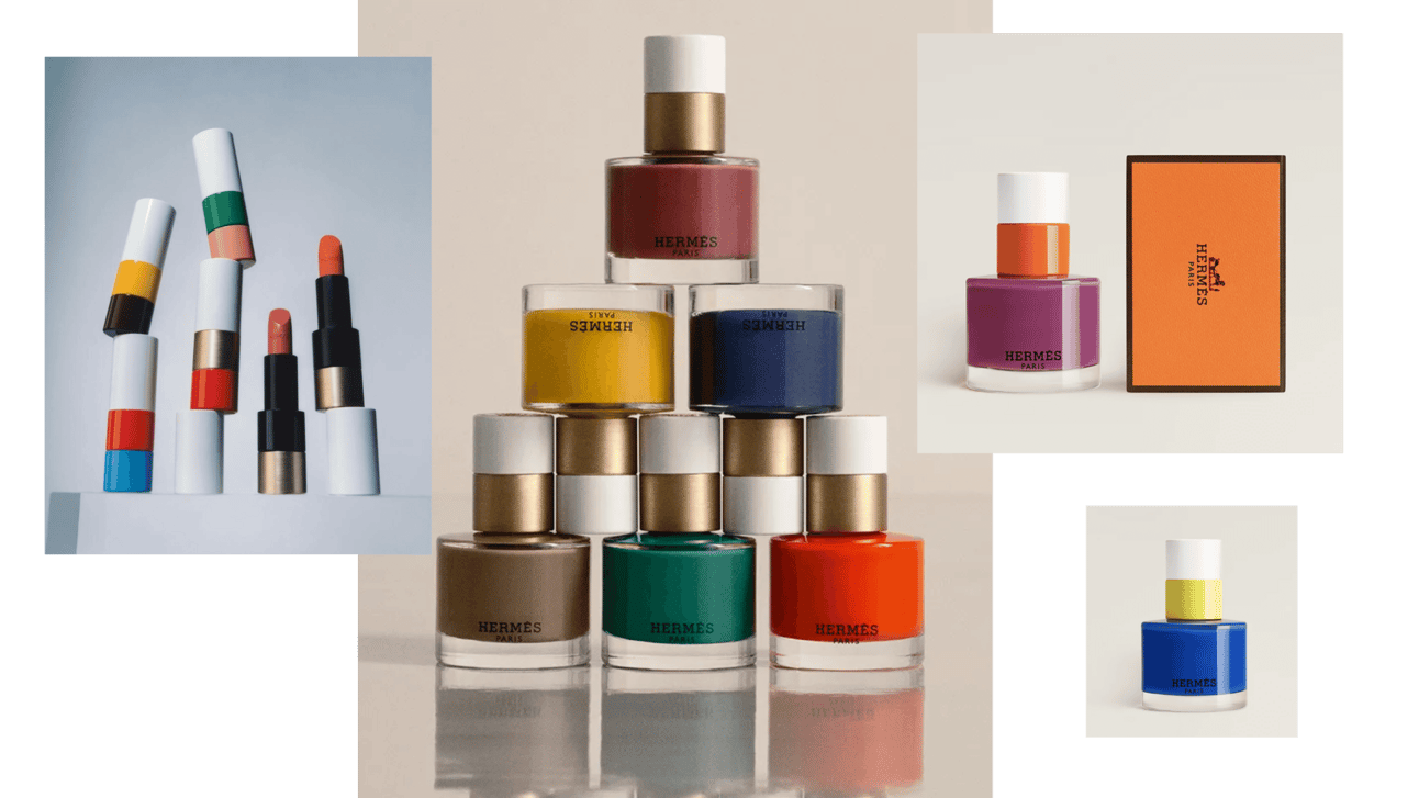
Hermès nail polish uses two-part cap with different colors. Creates modernist, artistic look. Like Piet Mondrian designed the packaging.
This design DNA (also used in their lipstick) isn't just beautiful. It's built to last and monetize for years. Every savvy businessperson's dream: creating product that's as profitable as it is stylish.
The cap design becomes brand signature across beauty categories. You recognize Hermès beauty products by the cap before reading the logo. That's design efficiency. That's monetizable IP.
Global nail care market expected to reach $38.5B by 2033, growing at 5% CAGR from 2023 to 2033. DIY solutions, vegan products, and gender-neutral positioning drive growth as category expands beyond traditional female-only market.
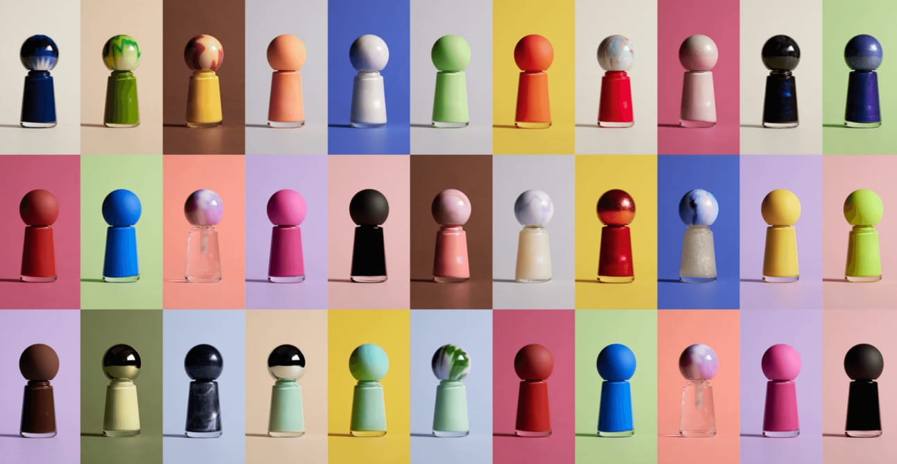
Color Dept: product image embedded in visual identity
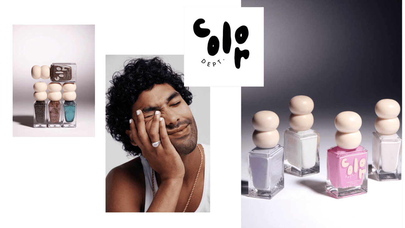
Color Dept's cap and logotype connect to one simple idea: polish drops.
Many brands experiment with cap designs. It's budget-friendly trick that seriously elevates visual presence. These special caps set tone. They bring vibe of droplets and handmade feel that boosts confidence to try at home.
The message: "Yeah, I can totally do this at home." The packaging reduces psychological barrier to DIY application by making it feel artisanal and accessible rather than professional and intimidating. Form following function. The drop-shaped cap isn't decoration. It's visual communication about what the product does and how approachable it is.
Paintbox: ride the trend before it peaks
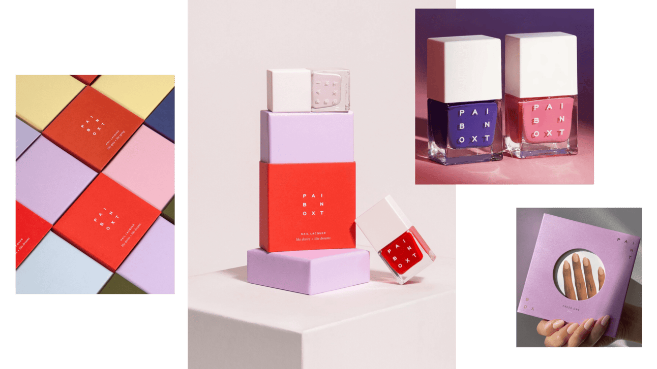
Paintbox began as creative nail studio in 2014. Really started booming post-Covid when DIY manicures took off. The shift to at-home nail care helped boost the industry. Paintbox rode the wave as part of the $10B at-home nail care market.
Their naming and positioning are straightforward: everything you need to perfect nails at home. Square, minimalistic packaging plays into square identity theme. Simplicity and functionality.
The cultural timing was perfect. They built the studio infrastructure before the pandemic forced everyone to learn DIY. When the trend hit, they had credibility and product line ready. You can't time a pandemic, but you can position yourself to benefit when cultural shifts happen.
Common Mistake: Waiting for trends to peak before entering the category. Paintbox built nail studio in 2014, launched products, then scaled when DIY trend accelerated post-2020. By the time competitors noticed the trend, Paintbox already owned positioning as the professional-quality DIY solution.
Golf le Fleur: punk disruption of category aesthetics
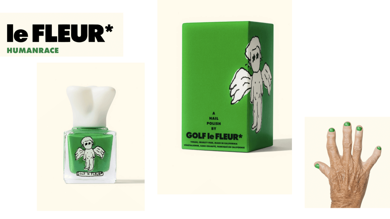
GOLF le FLEUR, Tyler the Creator's fashion and lifestyle brand (collaboration with Lacoste), embodies chic and boldly experimental style.
Nail care line packaging is distinctively "ugly." Exactly the type of design clients might initially reject. But in fashion and beauty, making noise and embracing the odd often works to brand's advantage. Usual beauty trends take backseat to musician's unique vision. This brings extraordinary flair to nail care line that would otherwise compete on traditional beauty aesthetics (elegant, feminine, refined).
Tyler disrupts category rules. Be punk. Ruin the conventions. Even if you're a rapper entering beauty, you don't have to follow beauty category design language. You can import your existing aesthetic and force the category to accommodate it.
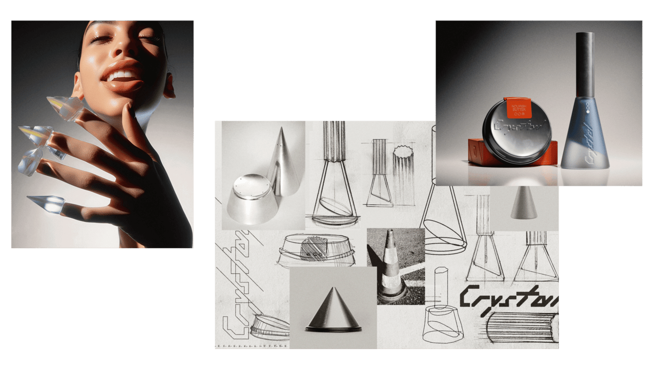
Crystal: experiment with narrative and form
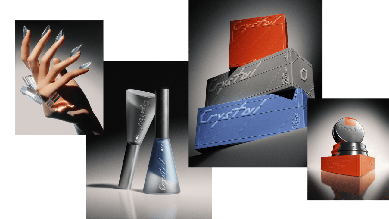
This is our creation in nail care. Meet Crystal, next-generation nail care brand concept merging futuristic and science-backed approach.
The premise: In augmented reality future, traditional physical colors and designs on nails may become outdated. Any style can be selected in digital world. This shift emphasizes nail health over aesthetics. That's why we created a set for healthier nails.
From packaging shape sketches to final branding, modeling, and rendering visuals, we executed thorough branding journey. Used Midjourney to create campaign pictures and run experiments.
The concept explores what happens when aesthetic choice becomes digital overlay rather than physical application. If AR can change nail color instantly, the product value shifts from decoration to health maintenance. That repositions the entire category.
Category intelligence: what's driving nail care evolution
- Market expansion through gender repositioning. $38.5B by 2033 (5% CAGR). Growth driven by removing gender ceiling. When nail care becomes self-expression platform rather than femininity tool, market size doubles.
- Product innovation focused on DIY empowerment. Long-lasting, chip-resistant polishes. Quick-dry formulas. Eco-friendly options. Consumers want salon-quality results at home. Products that reduce skill barrier win. Paintbox and ChillHouse understand this. Stick-on nails and easy application remove intimidation factor.
- Social media driving nail art demand. Especially among younger consumers. Nail art becomes content creation opportunity. The nails are the canvas for Instagram posts. Product purchase justified by content creation value, not just aesthetic preference.
- Vegan and cruelty-free as baseline expectation. Not differentiation anymore. Table stakes. Consumers increasingly expect plant-based, cruelty-free formulations as default. Brands that don't offer this are opting out of significant customer segment.
- Seasonality and fashion-driven purchasing. Nail colors/effects experience significant seasonality. Higher sales in summer, lower in winter. Fashion-driven demand means collections tied to seasonal trends rather than permanent line extensions.
Nail care evolved from gendered beauty product to self-expression platform through packaging design that signals identity over femininity, celebrity brands that legitimize male and non-binary usage, and product innovation focused on DIY empowerment. Market growth to $38.5B by 2033 driven by removing gender ceiling and repositioning from cosmetic to fashion accessory.
May 9, 2024
.png)