When building brand, first steps feel thrilling—naming, design, maybe touch of shimmer in packaging. But once that's done? It's about scaling. Here's uncomfortable question most founders avoid: what makes brand truly investable?
Investors don't fall for aesthetics alone, they look for structure. Substance. Brand that can grow, scale, survive past founder's personality.
Cristina Nuñez, co-founder and managing partner at True Beauty Ventures, breaks it down into five P's investors look for: Positioning, Product, People, Performance, Partnership.
At Orchidea, we've seen it firsthand: brands winning long-term build across all five. Miss one—you're just another magnesium gummy in sea of sameness. While we can't optimize supply chain or get you into Erewhon, we can help build standout brand. This is a core layer that actually makes people care.
Let's examine wellness brands making customers obsessed. Each has distinct edge, loyal audience (400K+), and real revenue-making power.
The nue co: science-backed, style-conscious, ahead of curve
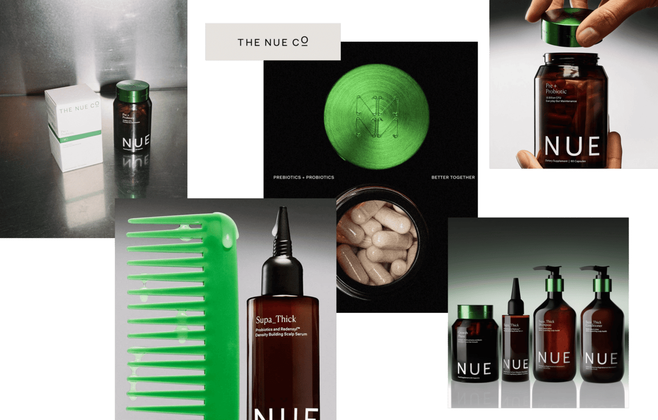
London-born and clinically inclined, The Nue Co. stands out fusing science-backed formulas with ethically sourced ingredients. Founded by Jules Miller after personal struggle with IBS, brand skipped crunchy granola aesthetic and carved lane feeling equally at home in dermatologist's office and Pinterest mood board.
At its core, The Nue Co. sells trust. The tone is scientific but never cold—it’s the kind of brand your therapist might recommend, and your designer friend already loves. They turned probiotics into a lifestyle essential, not a medical afterthought.
Wellness that earns authority through the TRUST attributes.
Dark glass bottles, combination of sans and serif fonts, and muted, mature green make The Nue Co. look like it belongs in a luxury bathroom — not a supplement aisle. It’s minimalism with depth. No millennial pink. No TikTok maximalism. Just quiet design that whispers "You’ve got your life together". Sophisticated packaging that makes you believe in the formula
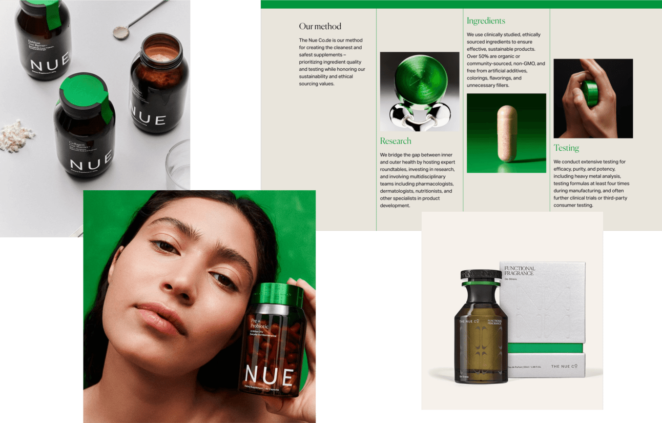
The Nue Co. didn’t wait for gut health to trend — they defined it (together with the Seed). While other brands made digestion sound clinical or drugstore-like, they reframed it as the key to everything: mood, energy, skin, sleep. That shift turned science into aspiration. They made gut health aspirational — and owned the category before everyone else caught on
Strategic pattern: Clinical authority positioning works when paired with aesthetic sophistication creating "therapist-recommended, designer-approved" dual credibility. The Nue Co. avoided wellness category bifurcation (either crunchy-natural or medical-sterile) by occupying both territories simultaneously. Dark glass, serif-sans typography mix, muted green signal luxury bathroom placement while scientific tone and ingredient transparency signal efficacy. This attracts customers valuing both function and form, willing to pay premium for supplements that work and look refined.
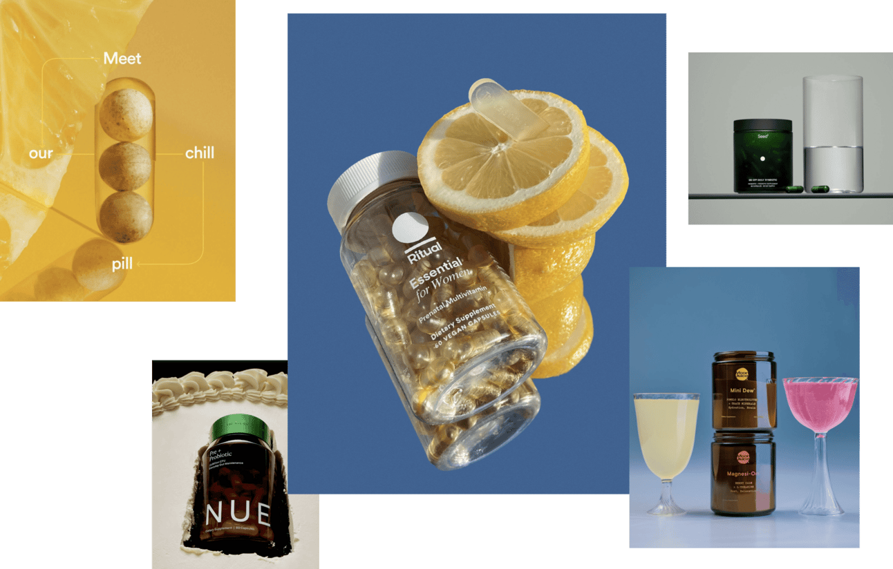
Ritual: transparent and built for long-term retention
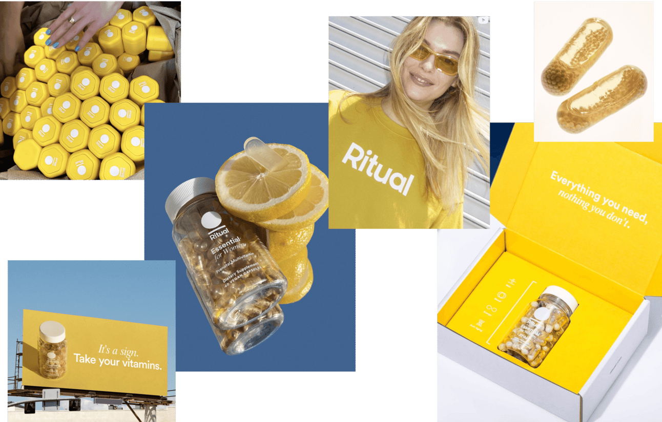
Ritual launched 2016 with clear mission: demystify vitamins. Founder Katerina Schneider built brand after struggling to find prenatal she could trust, quickly turning frustration into business model centered on clean ingredients, clinical validation, full transparency. Supplement brand that feels like skincare: traceable, beautiful, habit-forming.
Ritual turned supply chain transparency into a premium signal, not just a regulatory checkbox. “Made traceable” isn’t just a tagline. It’s the entire foundation. The see-through capsules are genius. They spark curiosity, signal quality, and serve as a literal metaphor for the brand’s promise. They made trust visual.
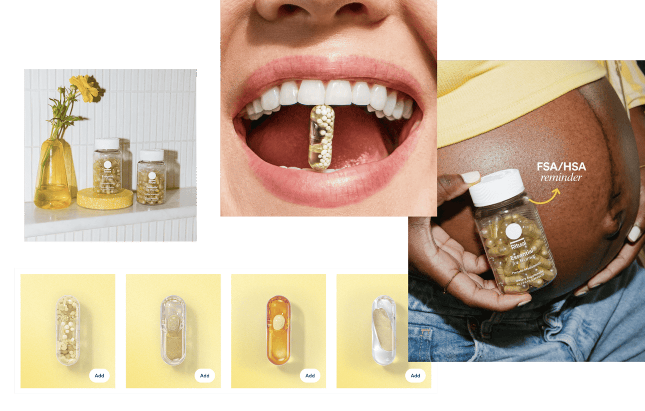
Ritual’s signature sunny yellow, it’s a psychological nudge. Yellow evokes clarity, hope, energy and the subtle promise of a more radiant, future-you! Paired with transparent capsules and rounded sans-serif fonts, the overall look feels clean, calm, and quietly confident. Monochrome minimalism pays off in the long run.
Instead of chasing trends, Ritual built around real life. From prenatal to postnatal, men to 50+, teens to menopause, every line fits into a long-term ecosystem. A clear split of core audiences and a roadmap for retention.
Orchidea strategic advice: For supplement brands targeting lifetime customer value with $300k+ brand development budgets, design product line architecture around life stages rather than ingredient trends. Ritual's prenatal-to-postnatal-to-50+ progression creates natural retention path where customers graduate to next appropriate product rather than churning to competitors. Combined with visual consistency (sunny yellow, transparent capsules, minimalist design) across all life stages, this builds long-term brand loyalty and increases customer lifetime value beyond single product purchase. Life-stage positioning also creates multiple entry points—customers can start at any relevant stage and still recognize brand ecosystem.
Moon juice: mystical, sexy, strategically strange
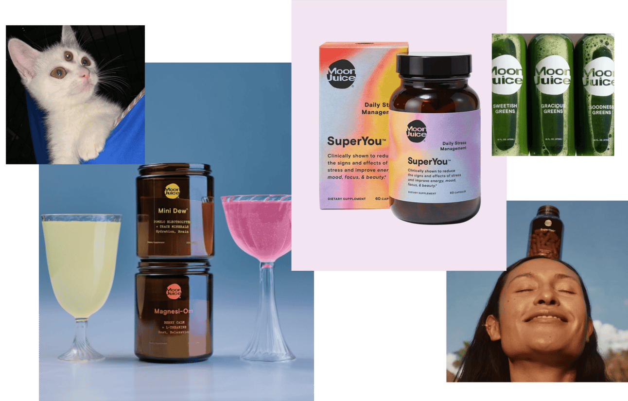
Before every wellness brand sold "dusts" and adaptogens, Moon Juice was already casting spells. Founded by Amanda Chantal Bacon in 2011, brand carved niche at intersection of beauty, sex, spirituality—made drinking powdered mushrooms feel like cosmic upgrade. This is cult branding at finest: part supplement, part fantasy.
Moon Juice wasn’t just selling products, it was selling a lifestyle religion. Sex Dust, Spirit Dust, Brain Dust — the names alone built intrigue and instantly made you feel like an insider. No long-form education needed. You’re either in the Moon Juice universe or you're not. It was radical, feminine, and totally weird… in the best way. Create a universe where customer want to jump into.
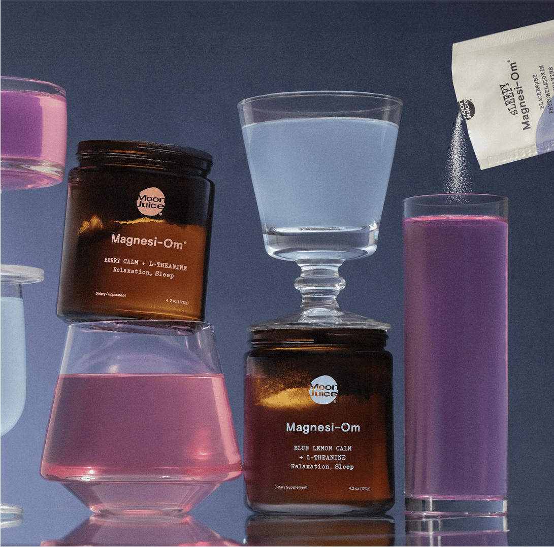
Moon Juice didn’t just launch powders, they launched potions. The packaging feels like it belongs in a Venice Beach apothecary or on the menu of a high-vibe bar. Dreamy logotype, soft gradients, and minimal typography all blend into a visual recipe that says ritual, not routine. Craft a user journey so beautiful, people want to shoot it, like cocktails.
Amanda Chantal Bacon is the brand. From her green juices to her controversial “food diaries,” she created a founder mythos that made Moon Juice feel personal and powerful and polarizing. But that’s what made it stick. She gave wellness a personality long before it was a branding trend. Founder-as-muse energy that built a community and a backlash, both fuel visibility.
Perla Helsa: designed to educate, built to elevate
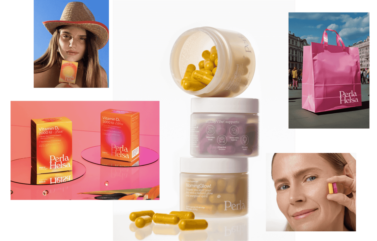
Perla Helsa positions itself as modern wellness brand grounded in scientific clarity and emotional resonance. Supports women's health at every stage, from sleep to glow, from immunity to calm. Brand doesn't just sell raw materials, promotes healthy beauty of women as lifelong journey.
At its core, Perla Helsa embraces a timeless truth: health is the foundation of beauty. Their products address real needs (hair loss, sleep, stress) while speaking to modern women in a tone that empowers. It’s not about correcting flaws, but about giving your body the support it deserves.
One clear idea echoed across product, design, and communication.
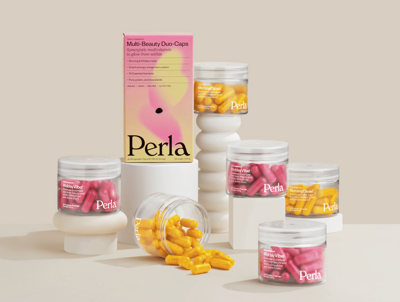
Perla Helsa’s visual identity blends emotional elegance with clinical clarity. At the center is the transformative shell—reimagined across lines. In the main supplement range, it appears geometric and structured; in the beauty line, it shifts into a soft, fluid form, blurred like it’s seen through water.
Typography is equally foundational—not decorative, but structural. With a strict hierarchy and refined layout system, it builds visual trust and reinforces credibility.
Visual idea adds variety, making each new product feel distinct while staying within the brand line.

The brand’s calm, elegant visuals make the packaging a favorite prop for content creators and customers alike. People just want to shoot it. And while it looks beautiful, the content goes deeper: ingredient explainers, health tips, and body literacy delivered without noise or nonsense. Authority built through aesthetic appeal and smart communication.
Seed: clinical, compostable, too smart to ignore
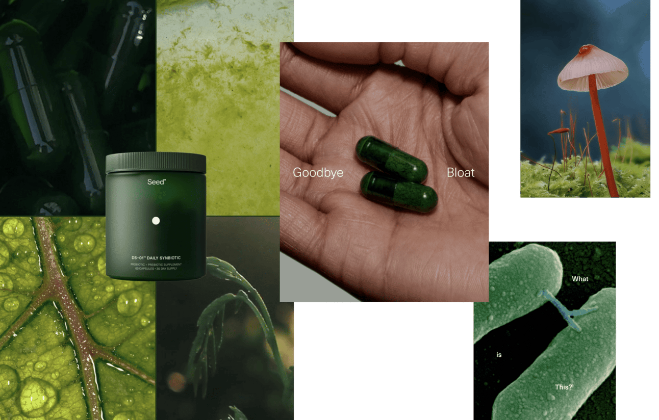
Seed isn't trying to be wellness BFF—wants to be biohacker's favorite brand. Co-founded by Ara Katz and Raja Dhir, Seed redefined what probiotic branding could be: clean, credible, deeply rooted in research. They don't just sell gut health—they educate the hell out of it. In category full of snake oil and sketchy promises, that's power move.
Seed's tone is crystal clear: we know more than you, and we’ll explain it, if you’re ready. From the copy to the product naming (DS-01™, anyone?), every detail says “we’re the future of gut health.” They're not simplifying science for mass appeal — they’re elevating it and trusting their audience to rise with them.
Confidence that attracts curiosity and filters the unserious.
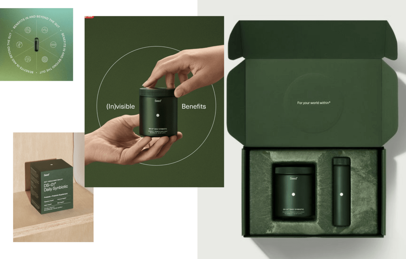
Seed's visual identity is precisely what you’d expect from a brand that cares about microbiomes: clean, structured, and intentionally minimal. Their iconic green refillable capsule is instantly recognizable — and environmentally designed. Typography is restrained. Layouts are tight. And nothing screams for attention — because when everything is considered, you don’t have to yell.
Seed’s social presence is textbook thought leadership. Their Instagram is packed with educational explainers, myth-busting carousels, and micro-deep-dives on everything from skin-gut connection to how transit time affects nutrient absorption. They make probiotics feel like a wellness discipline, not a trend.
Seed's clinical nomenclature (DS-01™), pharmaceutical-style precision, and unapologetically dense educational content intentionally filters audience. This creates smaller but more committed customer base willing to pay premium and stick around long-term. Brands that dumb down science to maximize addressable market end up competing with mass-market supplements on price rather than differentiation. Seed proved opposite strategy works: elevate science, trust audience intelligence, attract people who value depth over simplicity.
What we're seeing: Supplement brands with 400K+ followings win through universe-building, not ingredients. Consistency across product, packaging, and content, until the brand becomes a world customers want to live inside. Amazon brands that visually and verbally blur together are stuck competing on commoditized ingredients. The stronger brands compete on identity, taste, and belonging.
How to use this intelligence:
- Define distinct positioning territory (clinical authority, mystical wellness, transparency leadership, health-to-beauty) and commit fully. Hedging toward middle creates sameness.
- Design product line around life stages or complementary needs so customers progress to next relevant product within your brand rather than graduating to competitors.
- Invest in education-first content over advertising. Teaching creates qualified customers who understand why they're buying, increasing retention and reducing returns.
- Maintain strict visual consistency across entire product line. Define color ownership, packaging system, typography rules and apply to all SKUs without exception.
- Use product naming to create insider language. Names do cultural work beyond identification, building communities through shared vocabulary.
August 13, 2025