Remilia Hair
Haircare rebrand driving +69% AOV and global expansion.
Context
Founded in 2018, Remilia began with a breakthrough idea: travel-friendly, single-use capsules that combined convenience with visible performance. Like many growing beauty brands, Remilia had a product consumers adored but an identity that no longer matched its ambitions. The brand’s style was recognizable, yet its design language risked blending into the crowded ‘clean beauty’ space.The founder knew the brand was stuck in the indie tier — loved, but not respected enough for retailers and investors.
With new opportunities for distribution and international growth, Remilia needed an identity that could signal premium quality and global readiness.
"Working with Orchidea on Remilia’s rebrand was an absolute pleasure. The team was incredibly organized, thoughtful, and truly sensitive to my vision and the purpose behind the rebrand.
They took the time to understand the brand’s essence and translated it beautifully into a fresh, elevated identity. I couldn’t be more satisfied with the process and the results."

Eliran Luzone
Founder & CEO of Remilia Hair
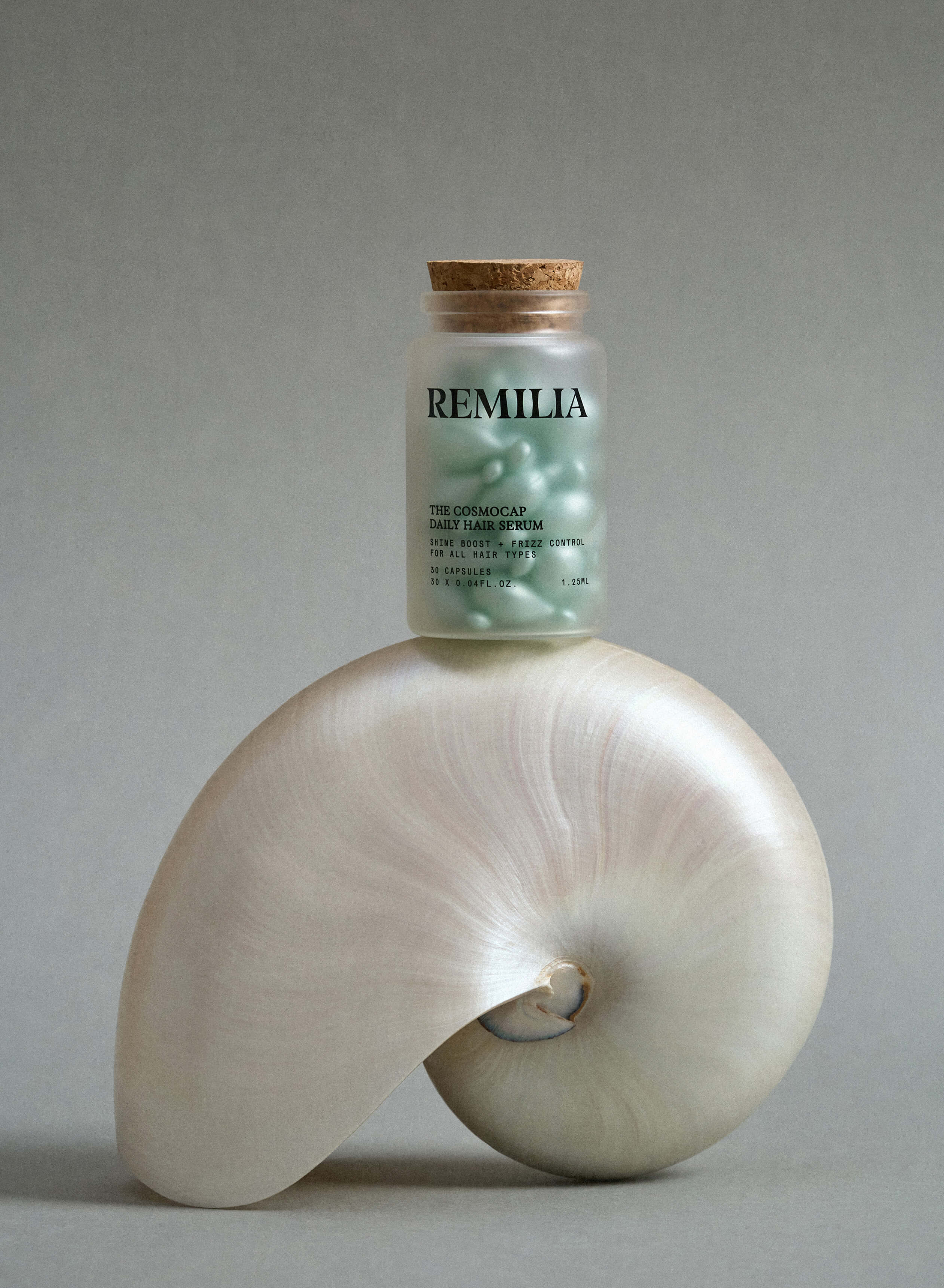
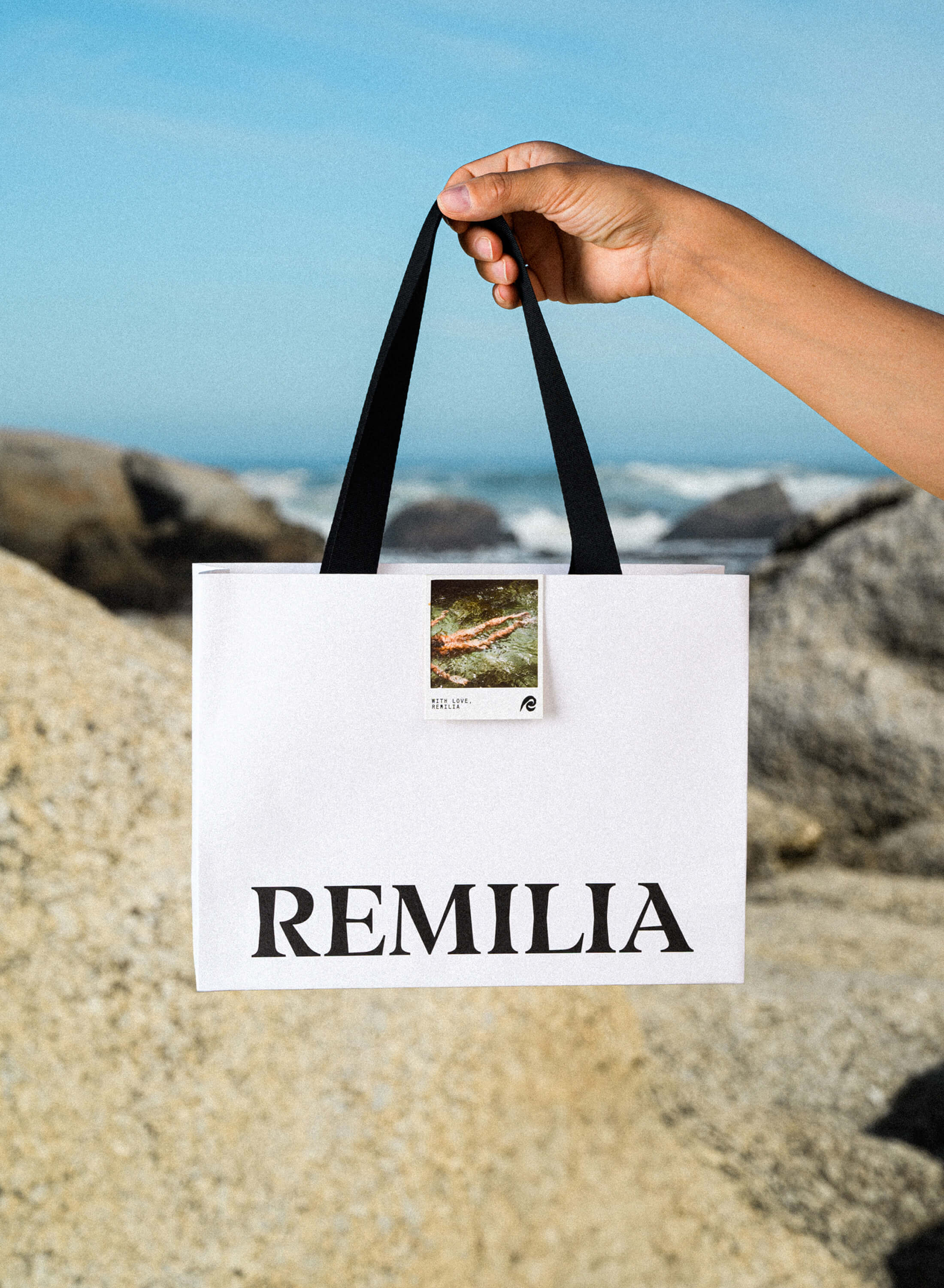
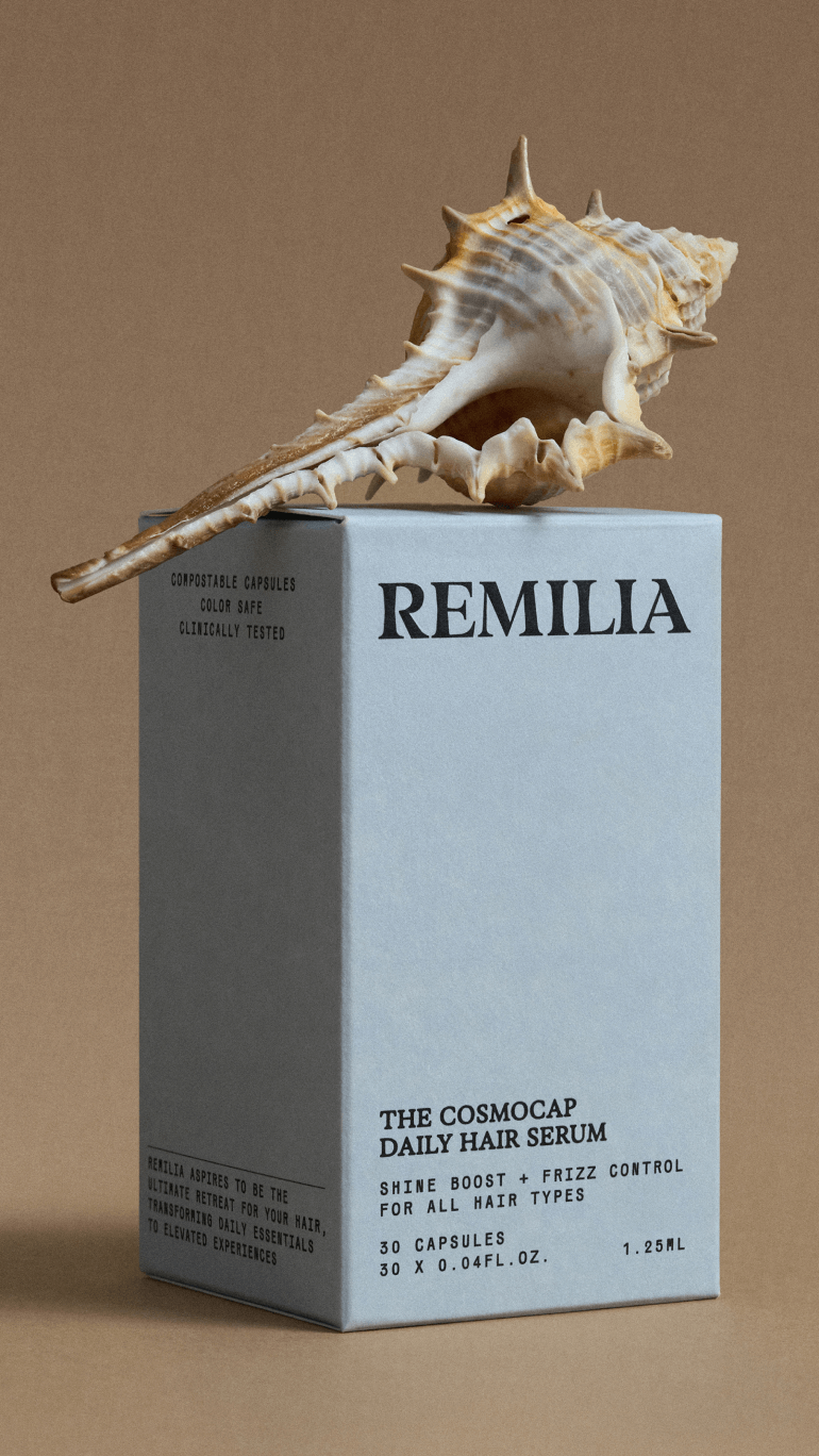
Emblem
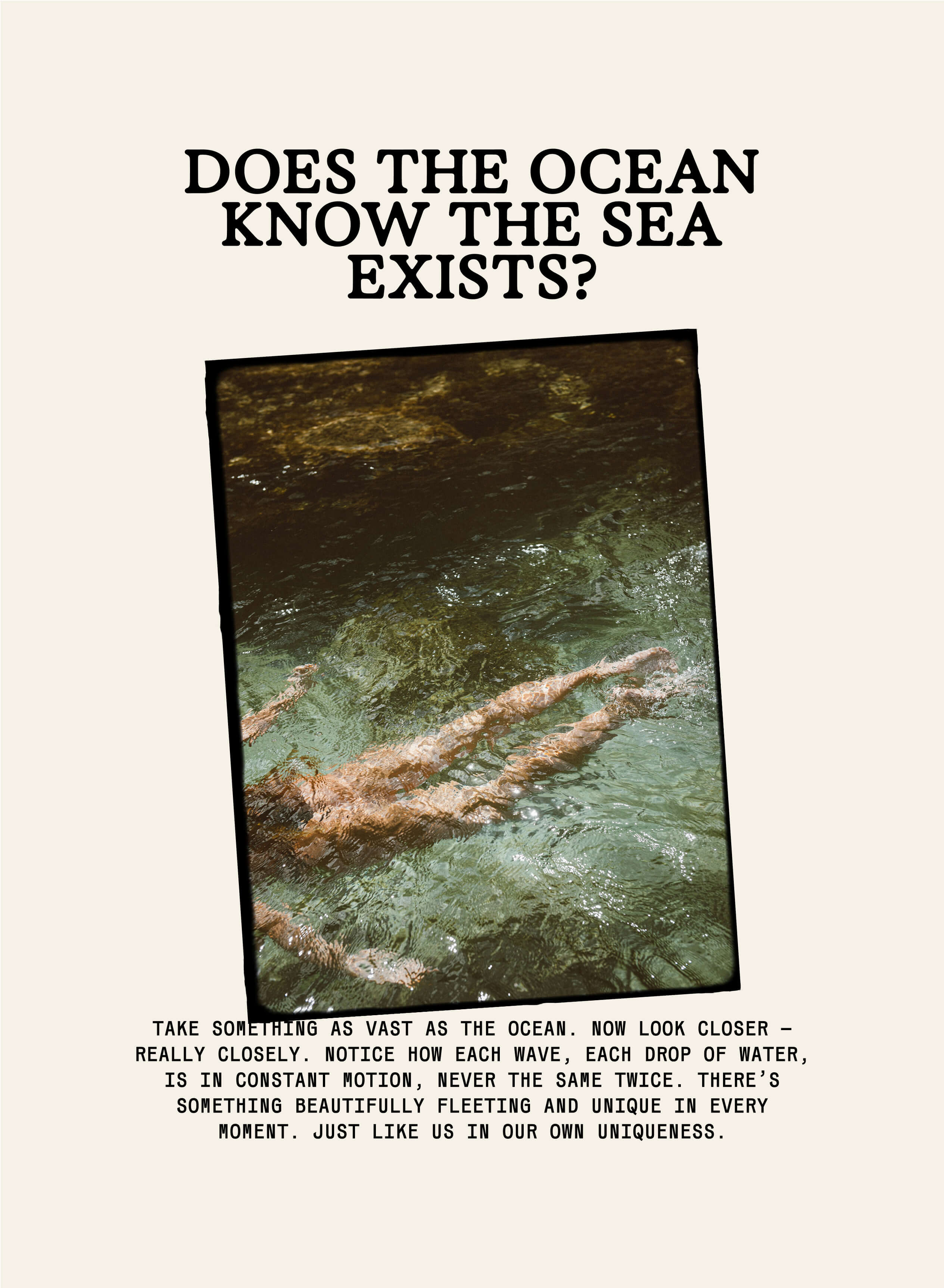
We incorporated a symbol into the logo — an abstract ‘R’ that simultaneously evokes a sea wave and a strand of hair, while preserving the handwritten spirit of the original mark.
Designed as a soft, flowing curve, it mirrors the natural movement of hair and the fluidity of water. Imperfect yet precise, the sign balances human warmth with scientific clarity — embodying Remilia’s essence of softness, indulgence, and renewal. A distilled emblem of the brand’s restorative philosophy.
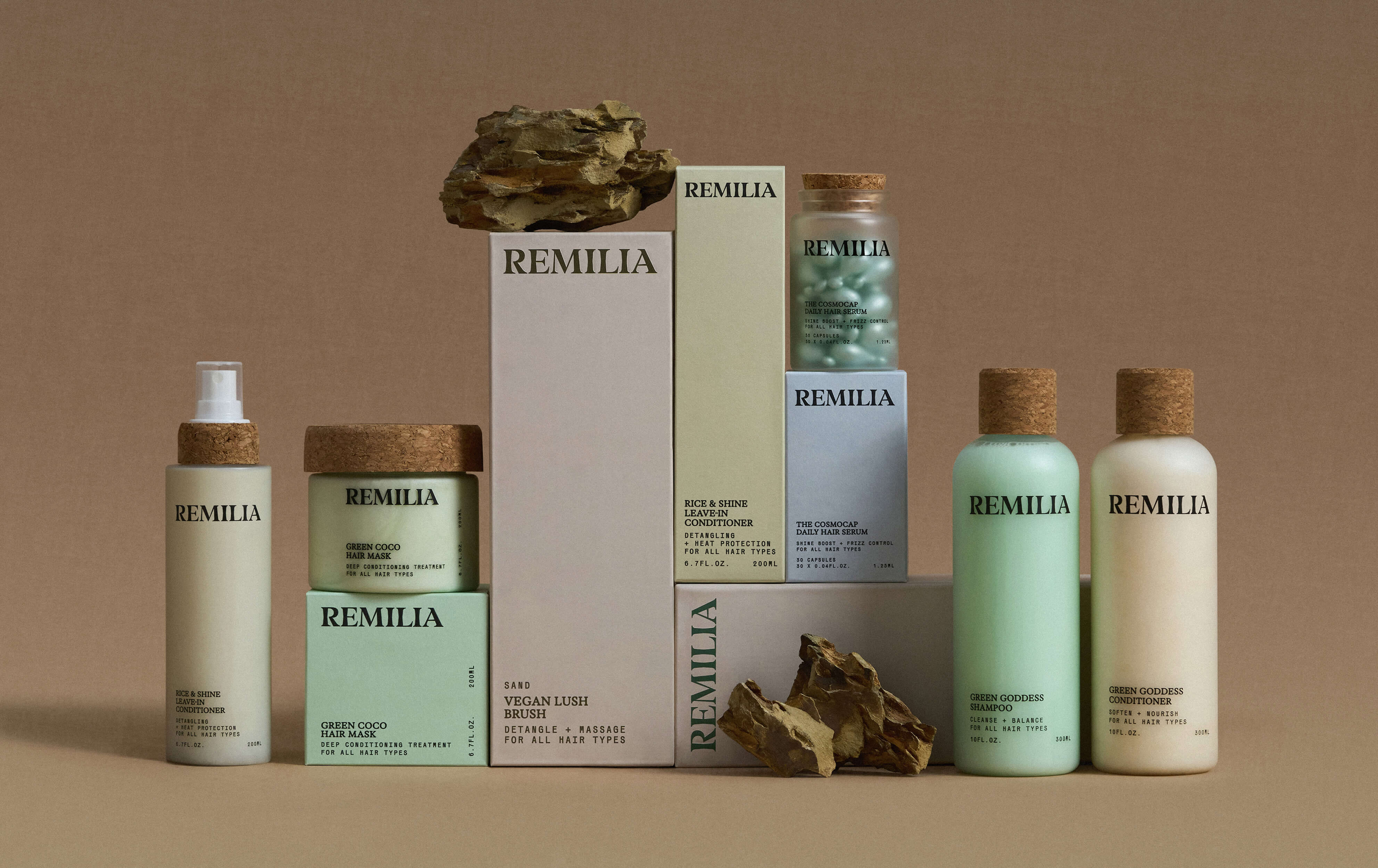
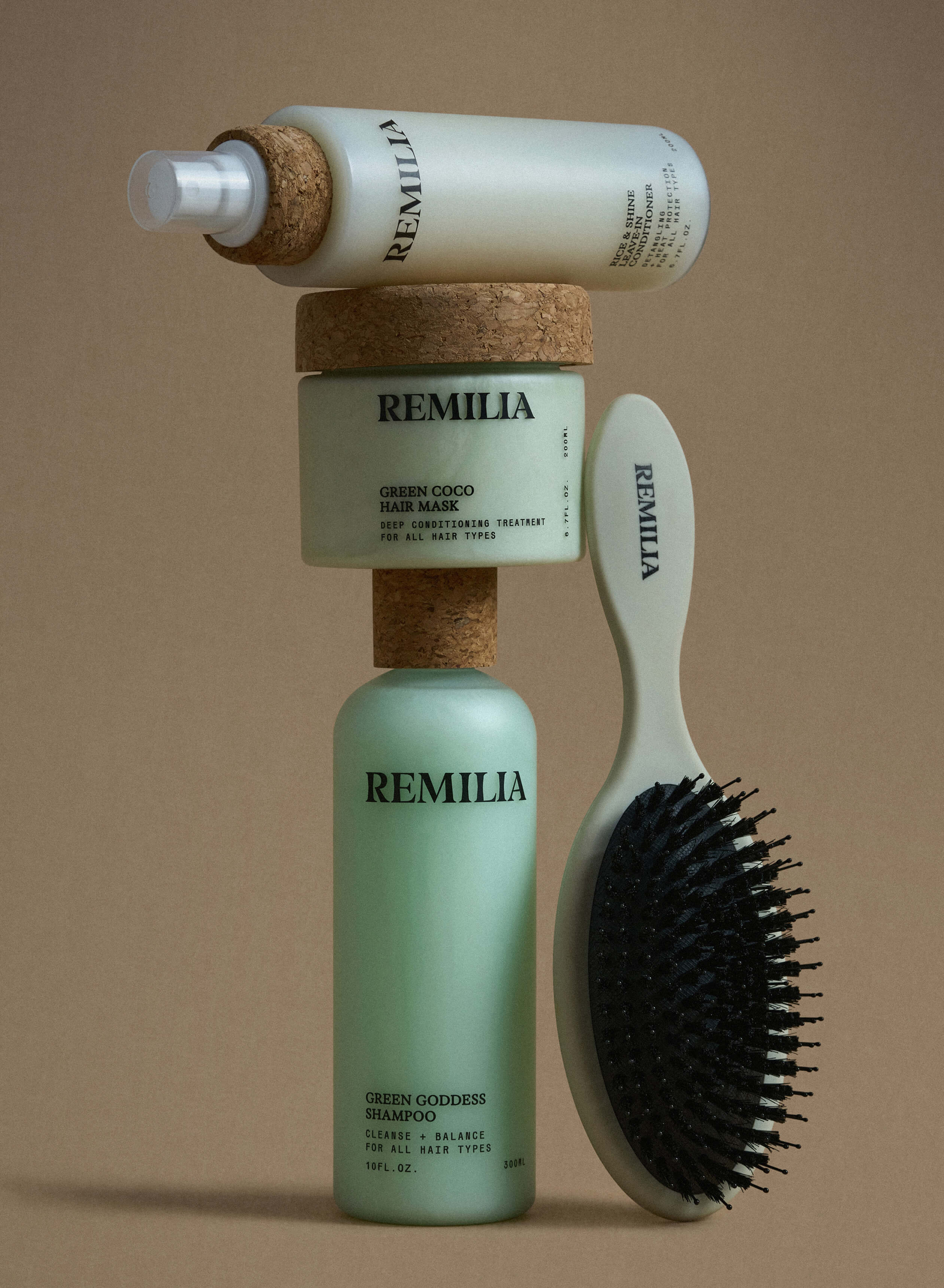
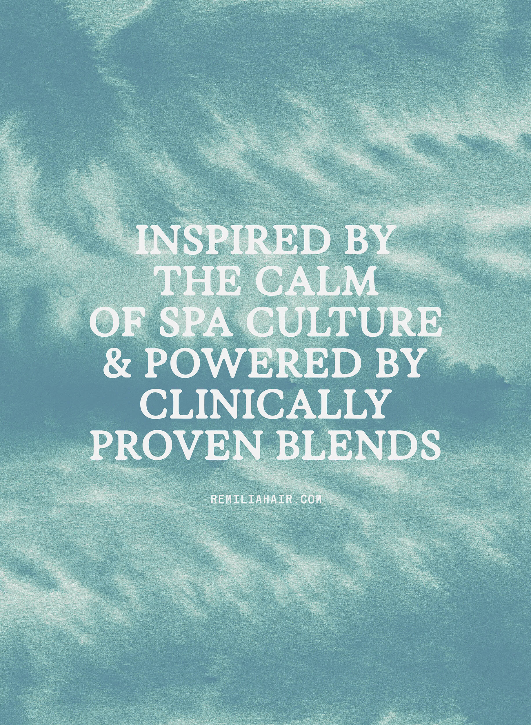
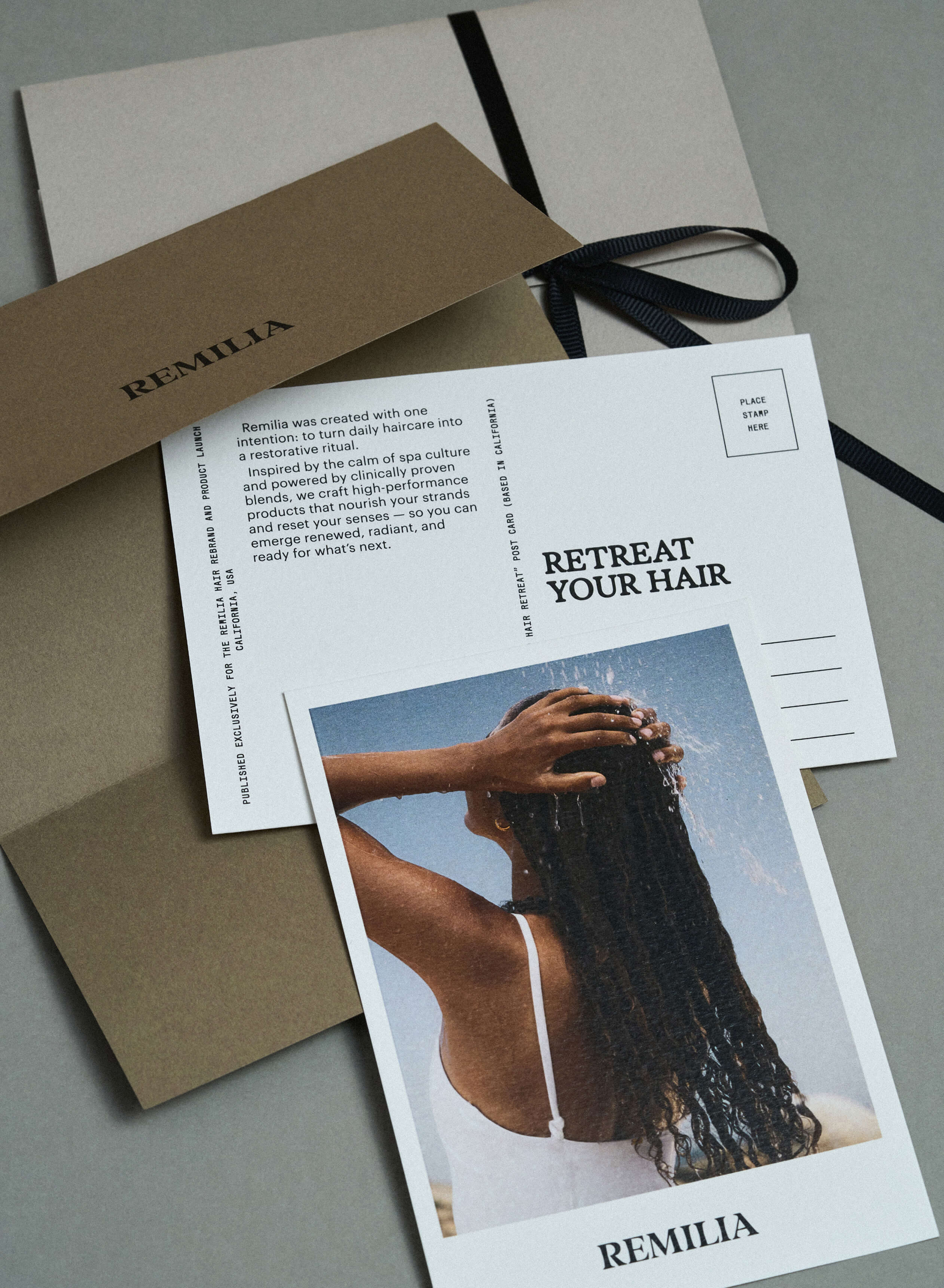
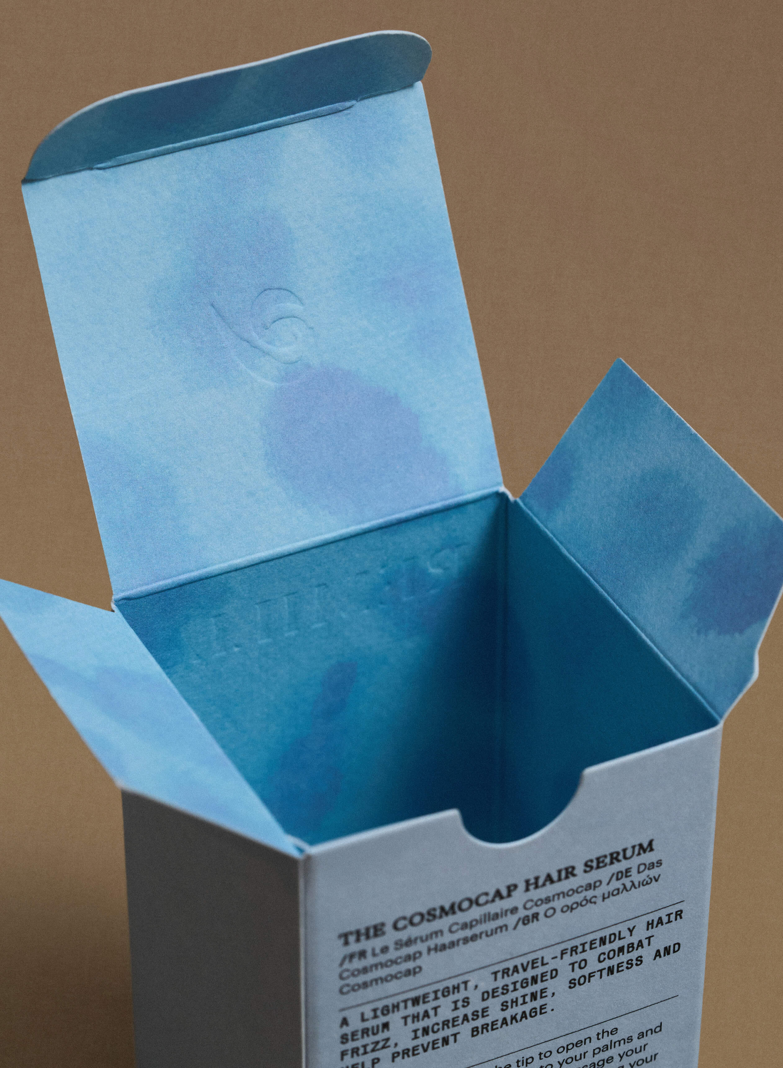
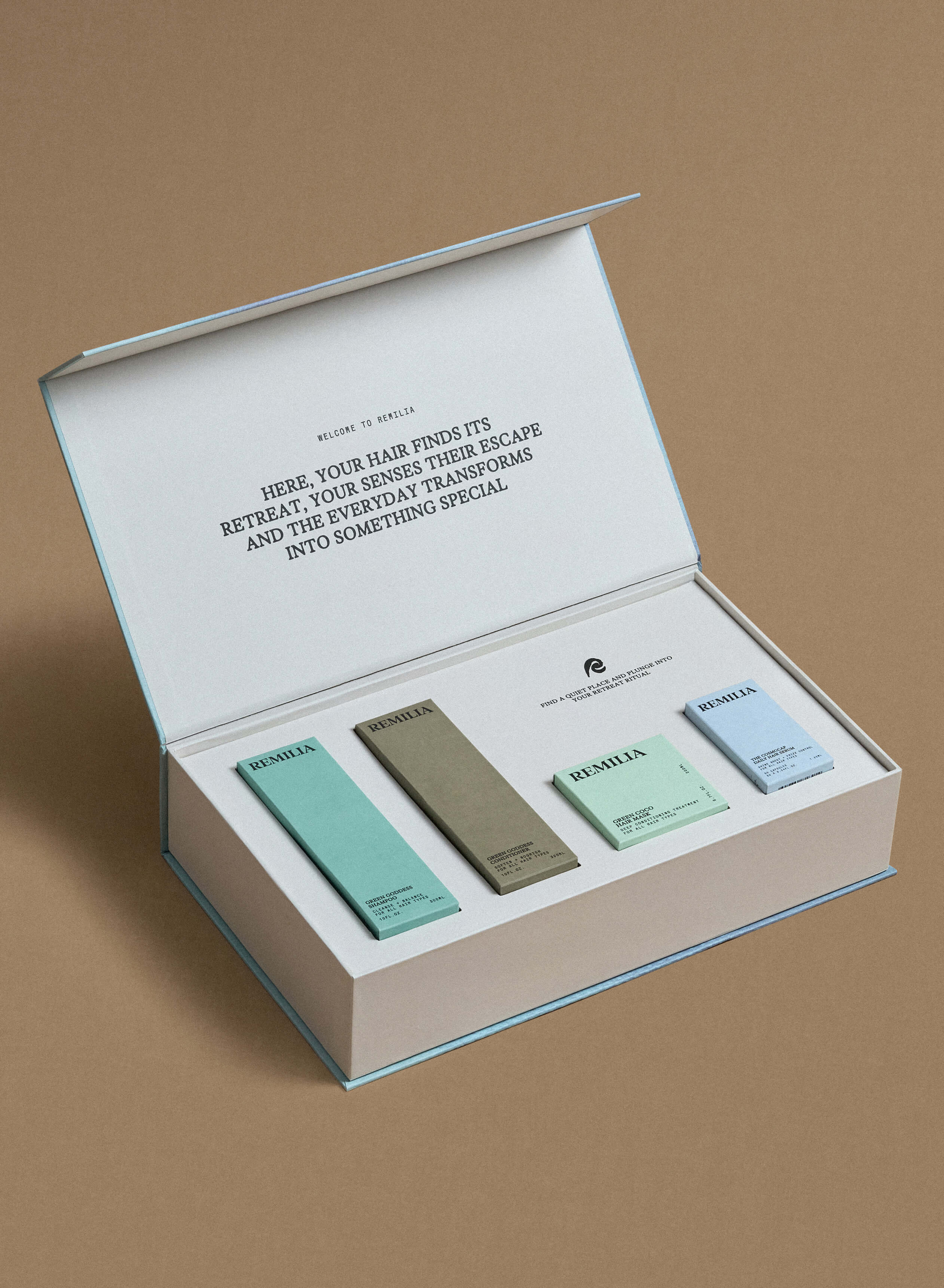
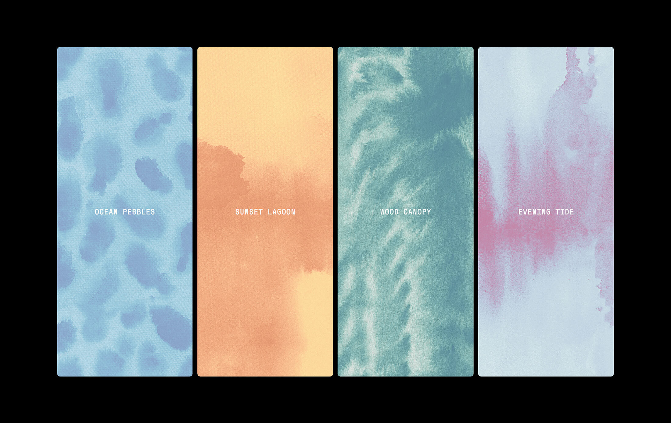
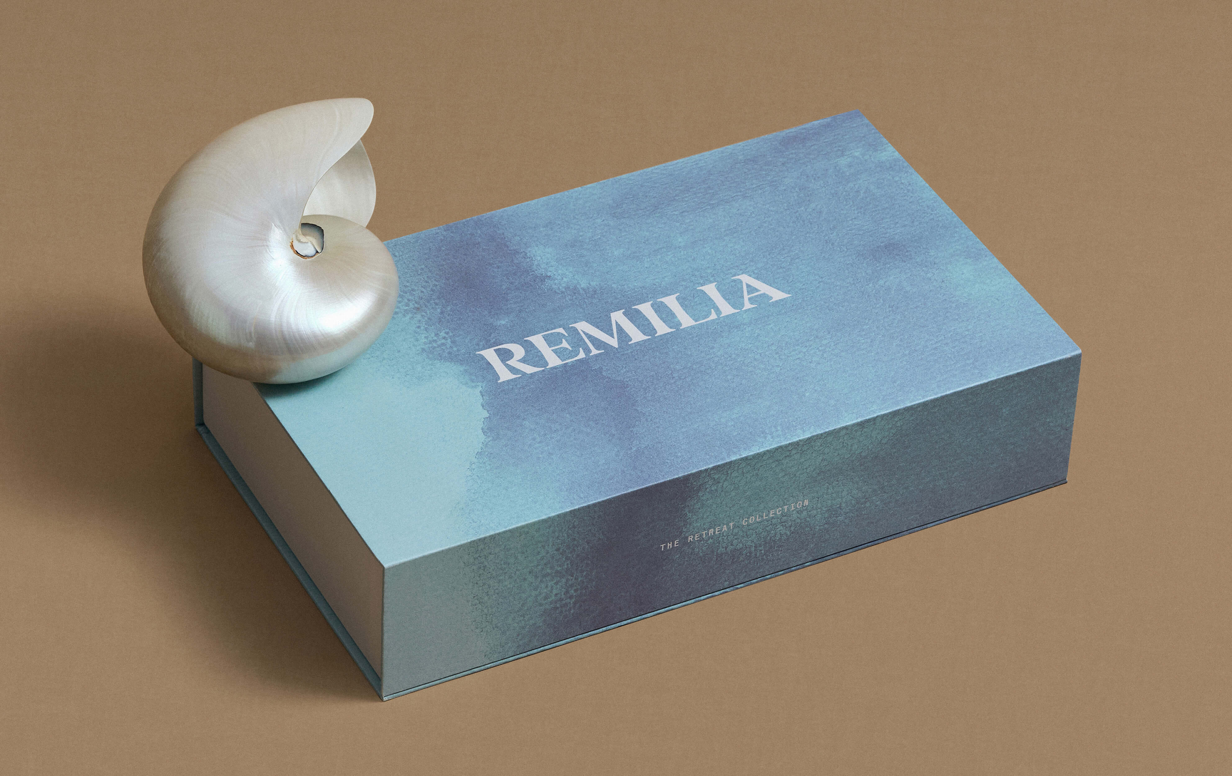
Patterns & Sensory Layers
We created watercolor-inspired patterns embedded inside the packaging — a hidden luxury detail, unique to each SKU. These blurred, oceanic motifs became a metaphor for movement and renewal, transforming unboxing into a sensorial ritual.
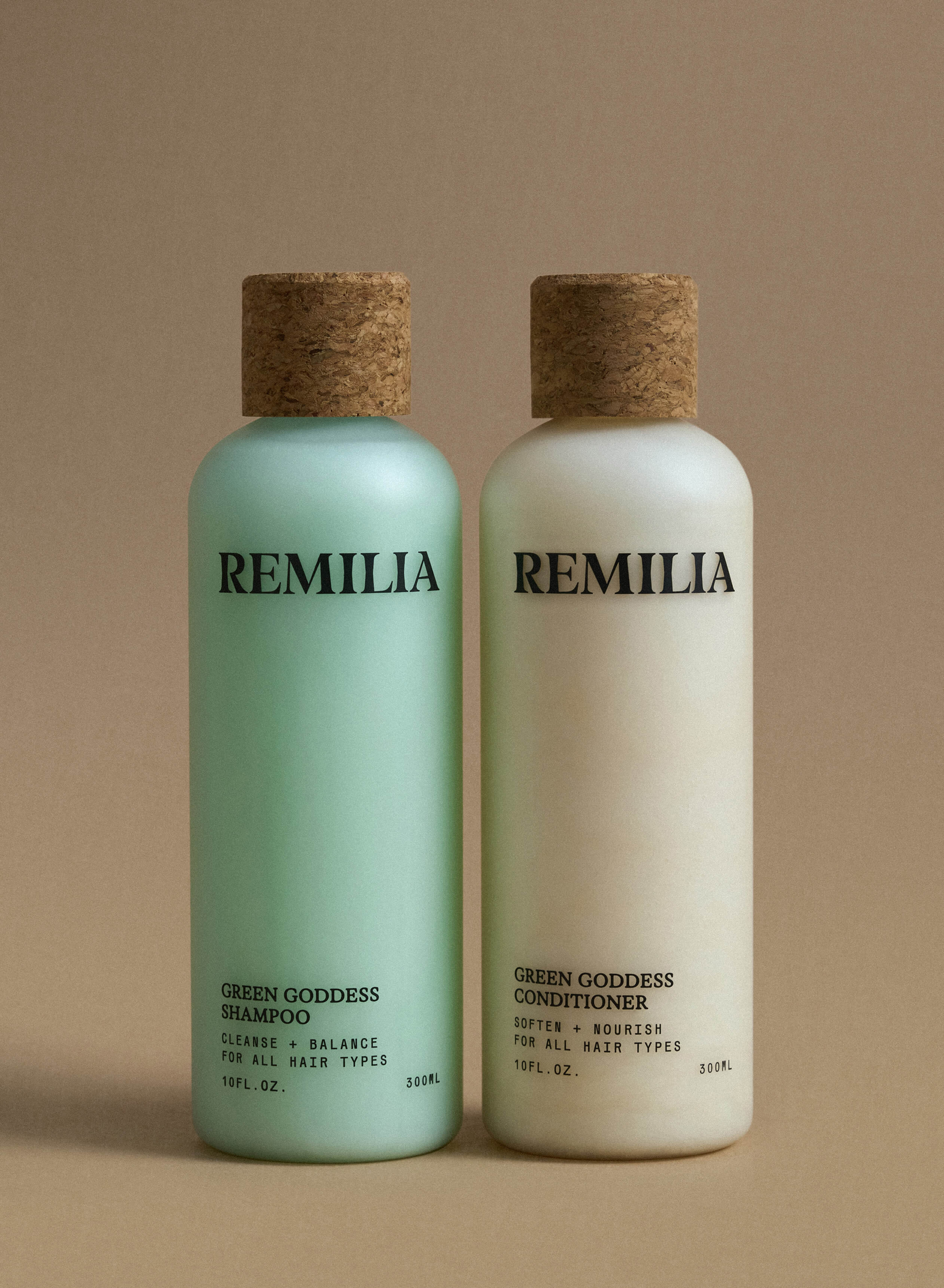
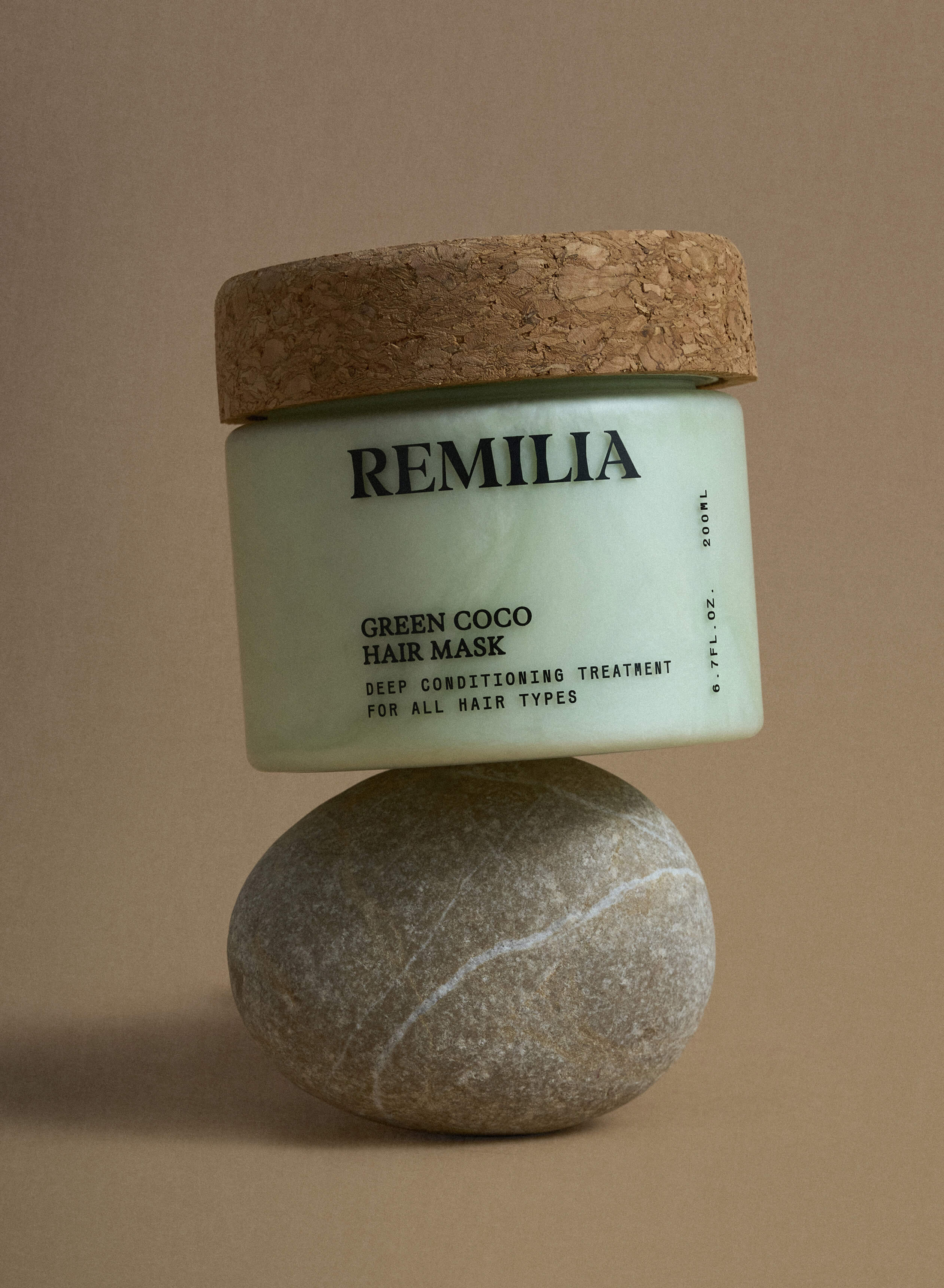
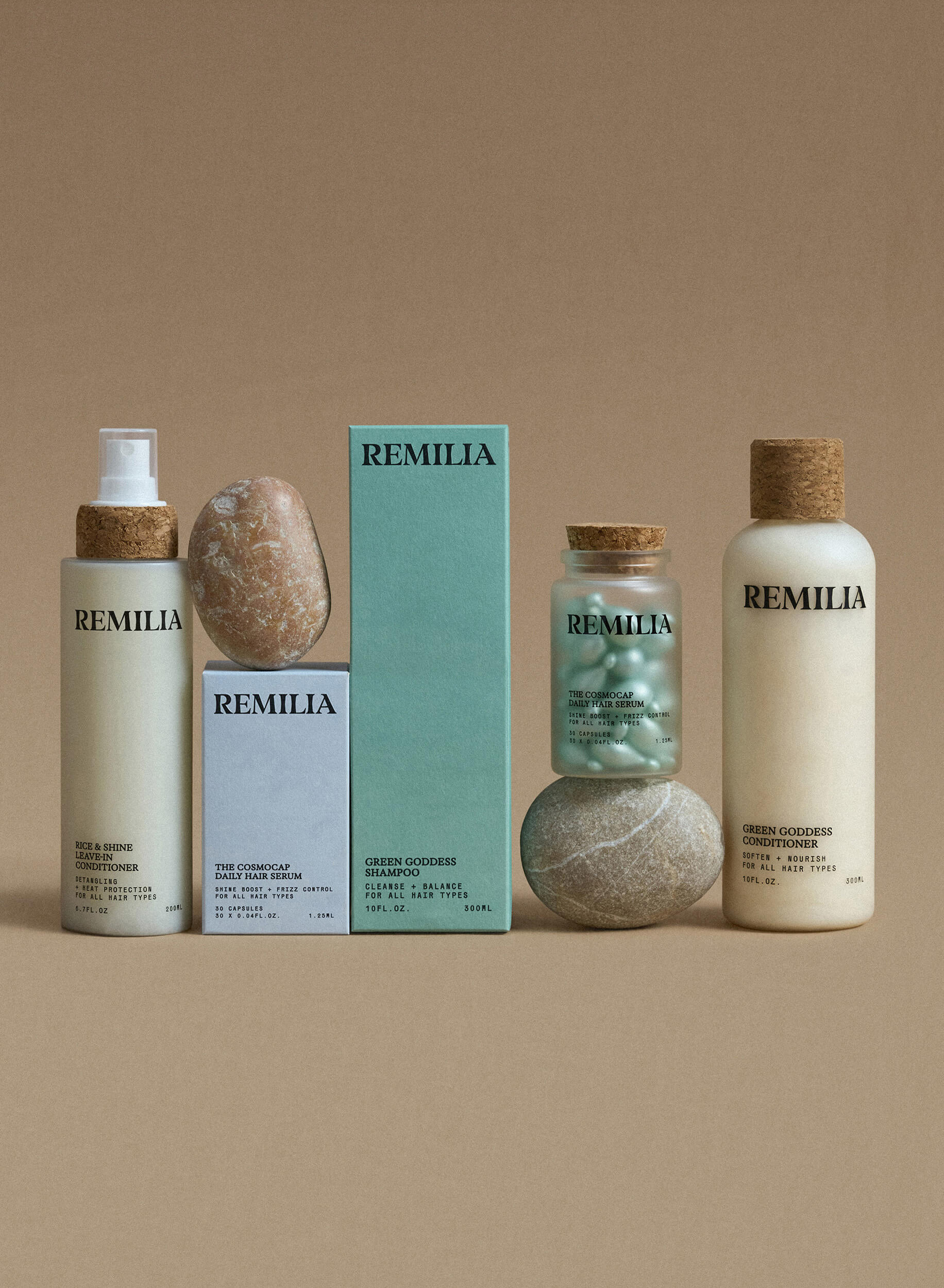
Typography System
We paired blurred, rounded serifs with a clean monospaced typeface — balancing indulgence and precision, emotion and science. Exactly the tension that defines Remilia’s philosophy.Together, these refinements created an identity that is elevated, aesthetic, and strategically aligned — a brand ready for retailers, distributors, and international growth, while staying true to its roots.
Credits
Valeria Shaposhnikova
Creative direction
Alexandra Romanenko
Art-direction & Brand design
Liana Babluani
Brand Strategy
Julia Vdovichenko, Vlad Klimenko
Photography
Services
Brand Identity
Brand Platform
Logotype & Emblem
Packaging
E-commerce Design
Social Media Kit
Pitch Deck
Design Support

.jpg)
.jpg)


.png)