Public Kitchen
Women-led PR agency that is focused on fashion brands.
Overview
Nastya and Zhenya approached us right at the beginning of their company's launch. With their strong vision in mind, our task was to translate it into a visually appealing brand identity.
Logotype
Instead of a traditional static logo, we developed a dynamic logo that can adapt to different situations. This dynamic approach creates a more engaging and interactive brand experience, capturing attention and improving brand recognition.
Details
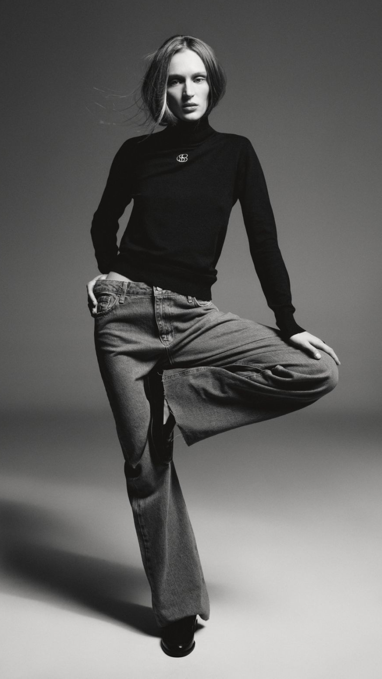
Bold, bright, but in the same way elegant. We created an identity and website conveying the founders' mood and lifestyle. Also, we created a logo in the shape of a chestnut (a symbol of Kyiv).
Results
Public Kitchen has become a highly regarded PR agency, particularly in the fashion industry. With its intense red color palette, the cohesive and holistic identity has become their trademark, distinguishing them in the market.


.png)